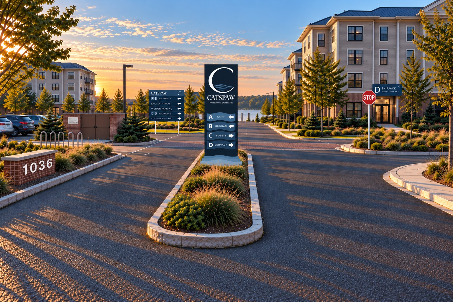
Catspaw
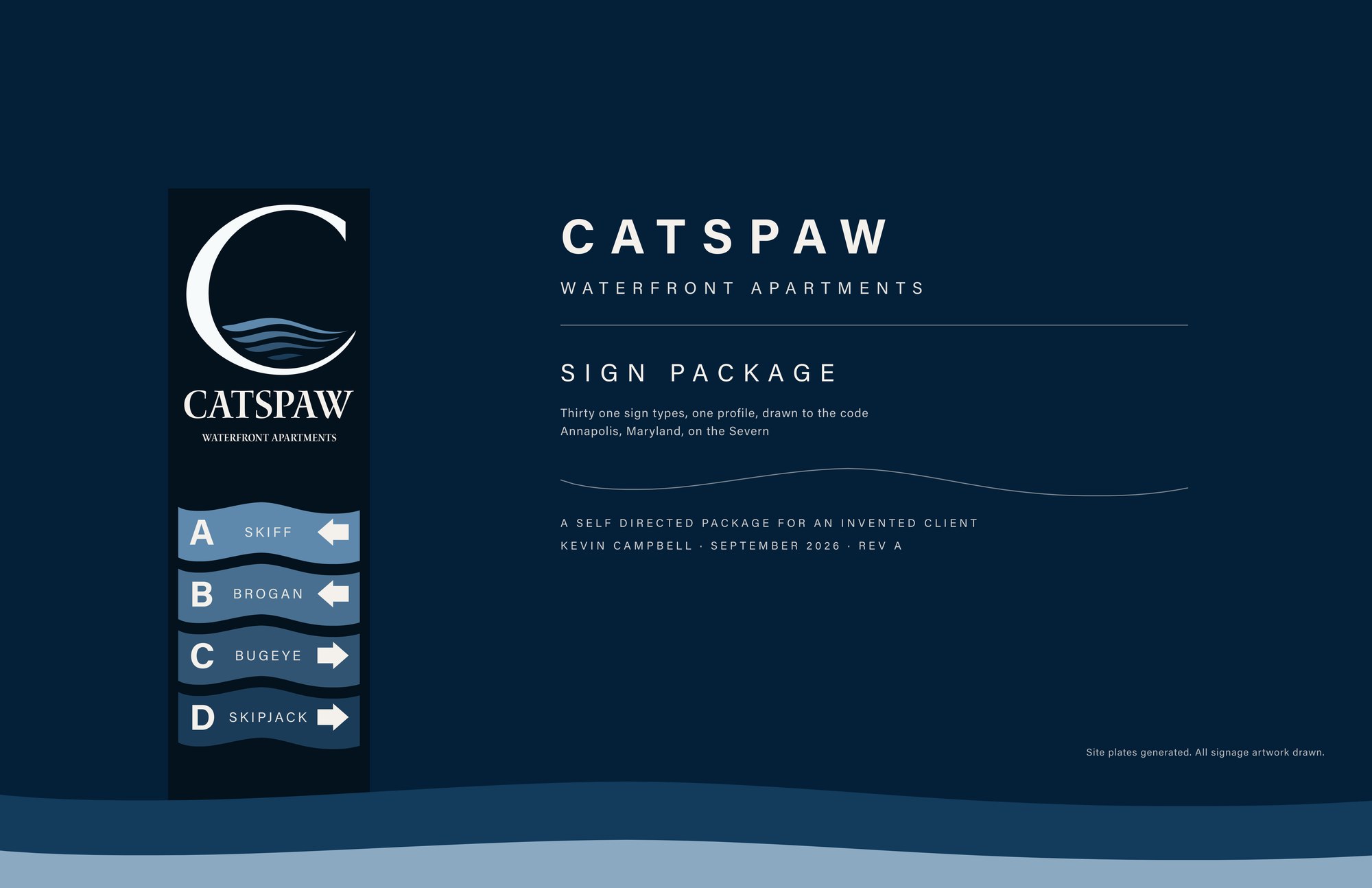
Identity and wayfindingfor a waterfront apartment community,drawn as a sign package a shop could build from.
Self directedThe community is invented. The codes, the materials and the reader distances are not. 24 sheets, 31 sign types, 354 pieces. Rev A, September 2026.
A catspaw is the dark ripple a gust makes on flat water, the first thing a sailor looks for. Every sign here carries that one ripple on one edge, from a ten foot pylon to a six inch plaque.
One profile, thirty one sign types
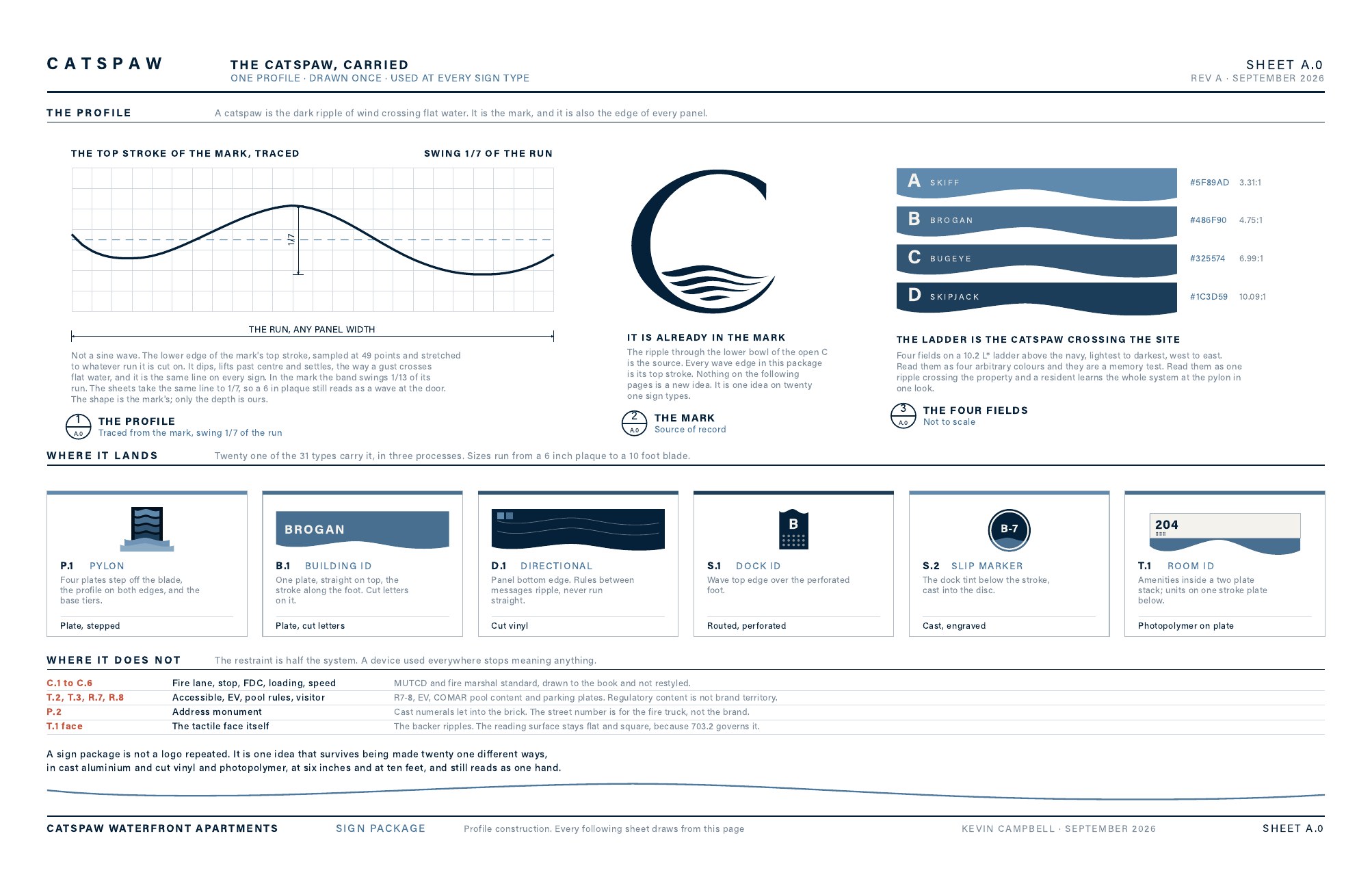
Catspaw is a waterfront apartment community near Annapolis, aimed at sailors. The mark is an open C with the ripple in its bowl, and the package is 24 sheets, 31 sign types and 354 pieces that carry the ripple from a ten foot pylon to a six inch unit plaque without the ripple becoming wallpaper.
The rule is simple enough to write on one line. Every navy or tinted panel carries the profile on one edge. Every regulatory panel carries none, because a stop sign that has been restyled stops being a stop sign. That restraint is half the system.
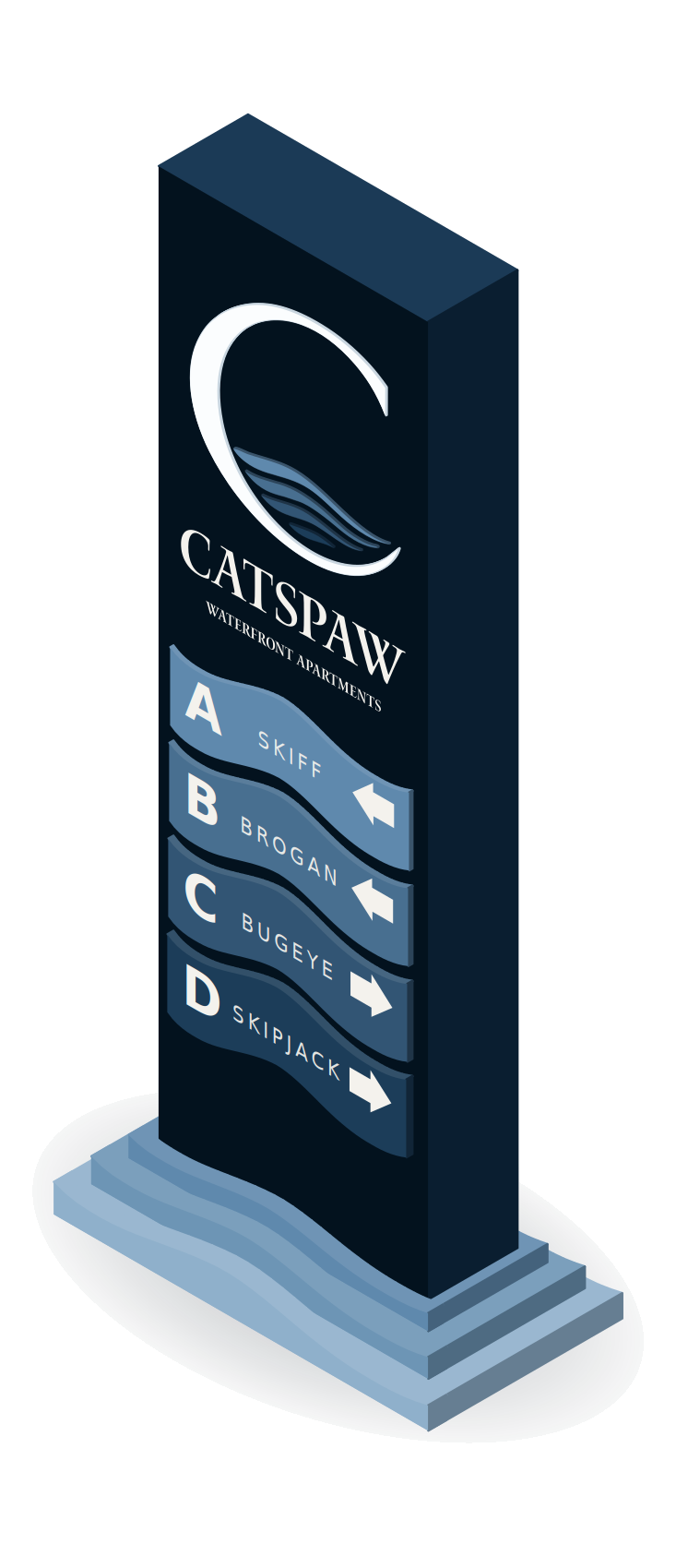
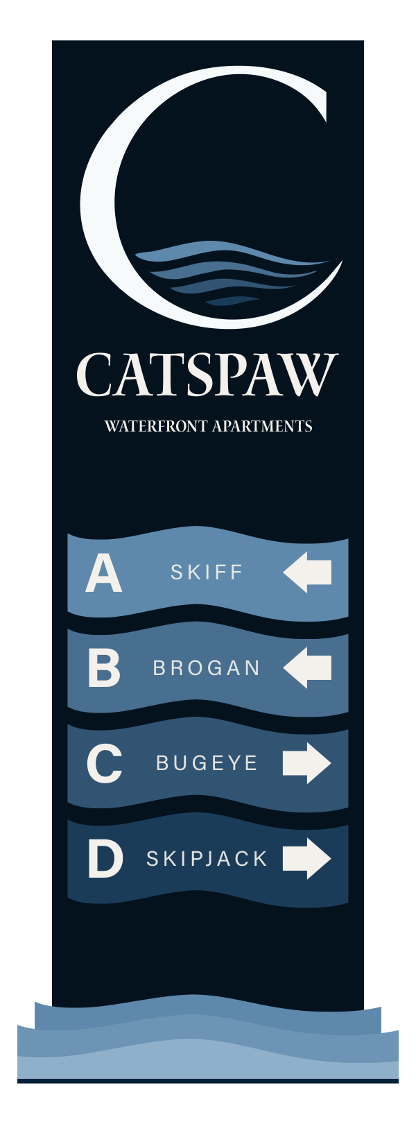
The four buildings are named for Chesapeake working craft, Skiff, Brogan, Bugeye and Skipjack, and each has a tint: four steps on a lightness ladder above the navy, 10.2 L* apart, so a resident learns the whole site at the pylon in one look and never has to read a tint as the only channel. The letter is primary on every sign read from land. The tint is always second.
The mark
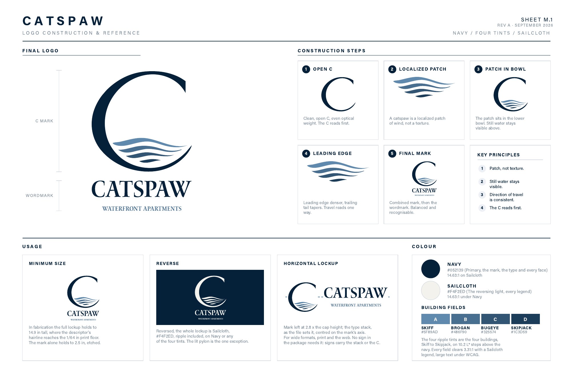
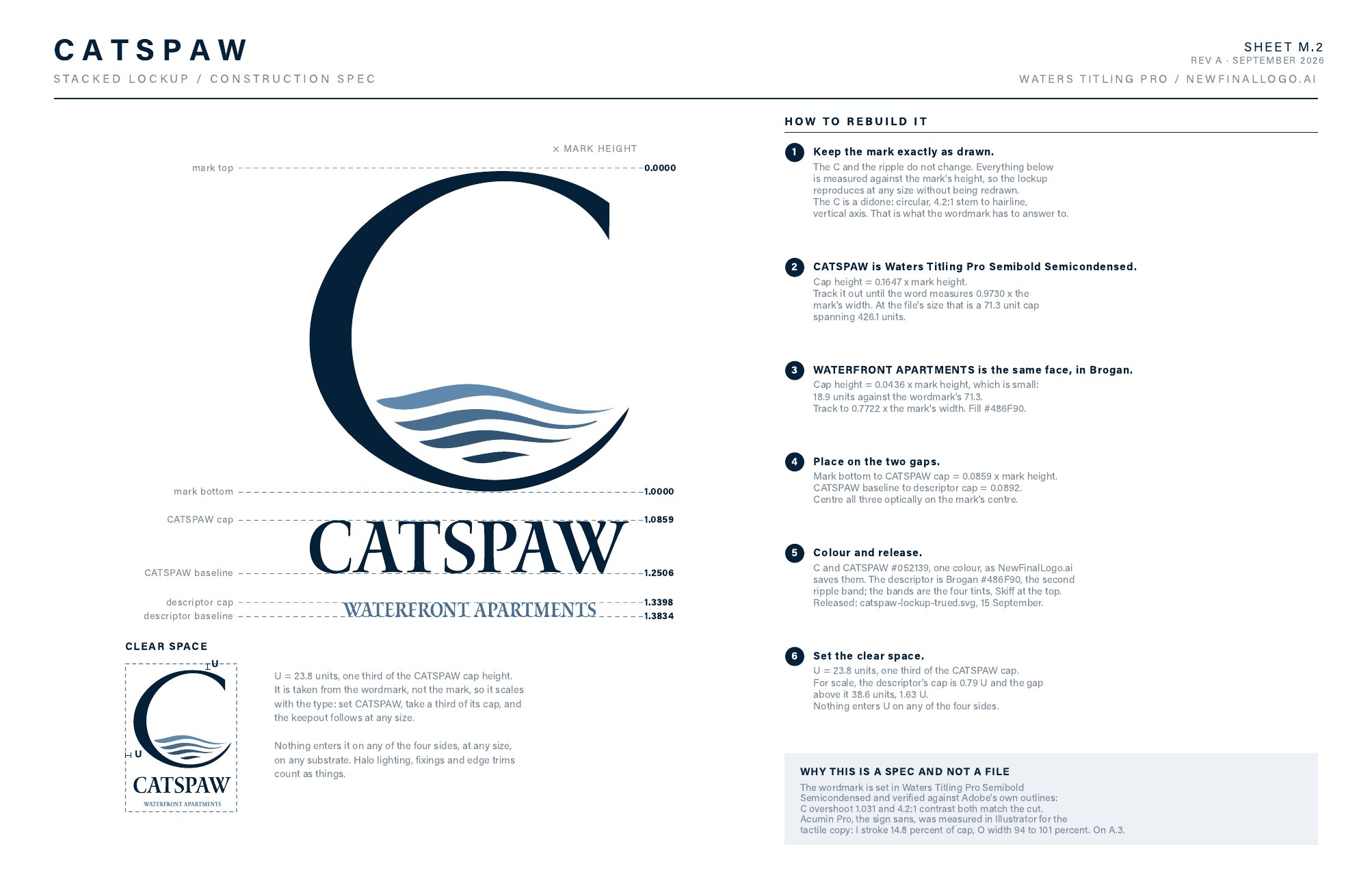
The C is a didone, circular, with a 4.2 to 1 stem to hairline contrast. The ripple is four bands in the four building tints, denser at the leading edge and tapering behind, so travel reads one way. CATSPAW is Waters Titling Pro, tracked to 0.973 of the mark's width. The descriptor is the same face at a cap height of 0.0436 of the mark, set in Brogan.
Nothing in the lockup is a guess. The gap from mark to wordmark is 0.0859 of the mark height, the gap from wordmark to descriptor 0.0892, the clear space one third of the CATSPAW cap on all four sides. It reproduces at any size without being redrawn, which is what a sign shop needs from a mark. The one exception is the lit pylon, where the ripple glows in its tints through translucent film.
The sketches
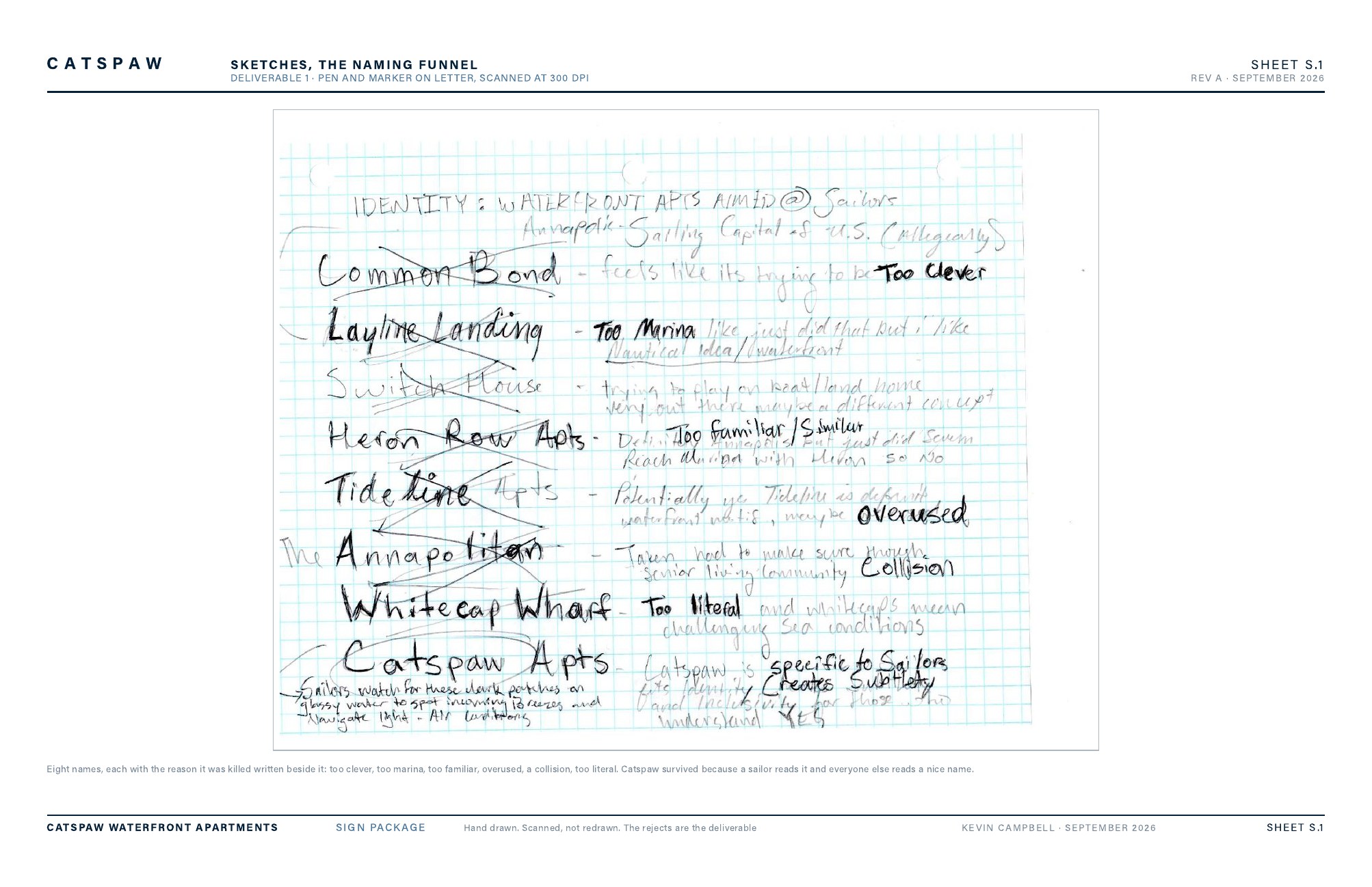
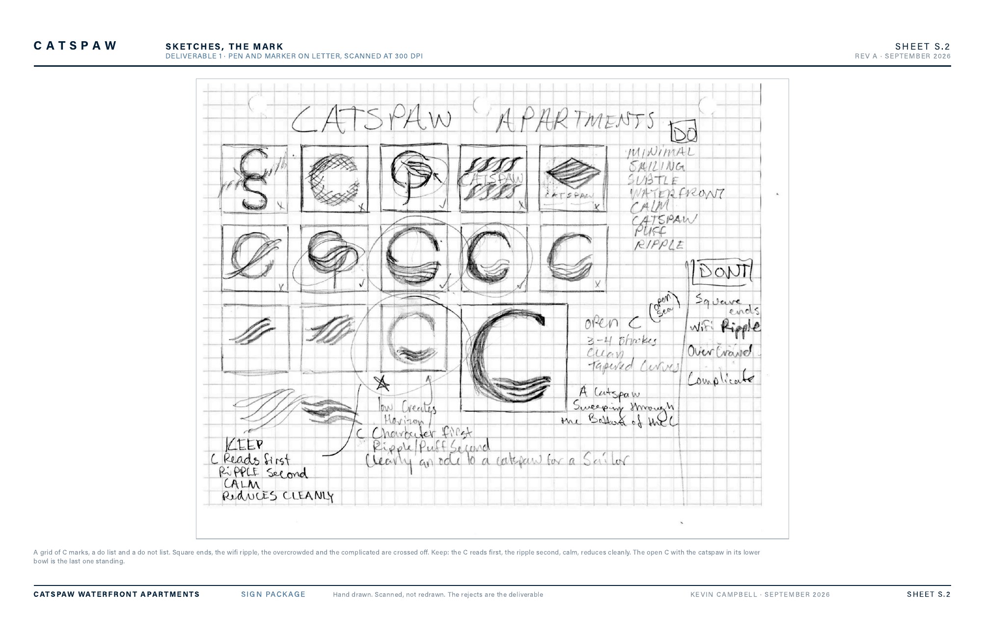
Eight names in my hand, each with the reason it died written beside it: too clever, too marina, too familiar, overused, a collision, too literal. Catspaw survived because a sailor reads it as a signal and everyone else reads it as a nice name. The rejects are left on the page and crossed out, because the funnel is the deliverable, not the survivor.
The site
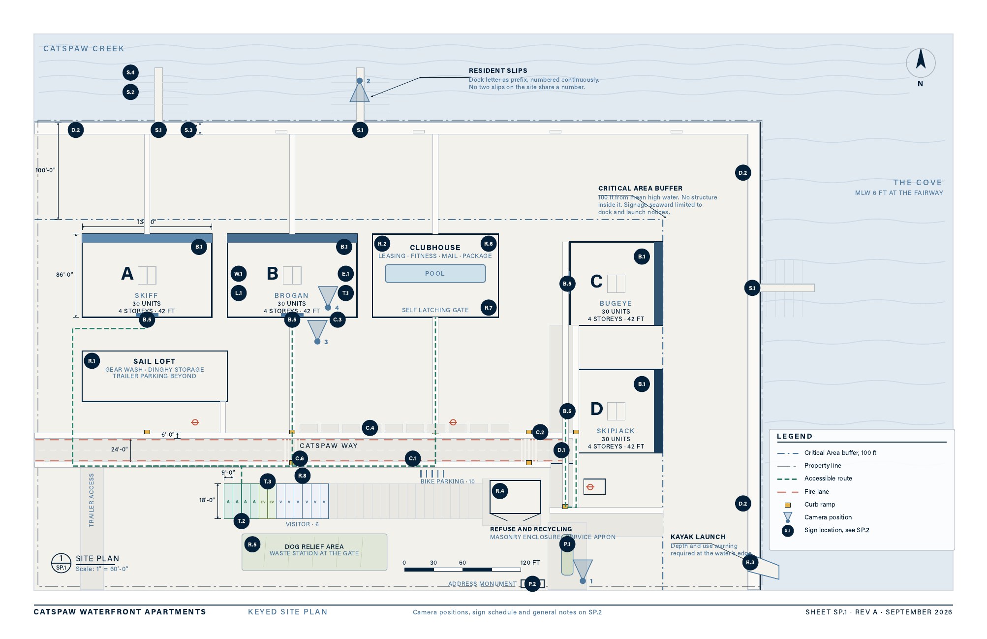
Four buildings of thirty units on Catspaw Creek, three docks with 34 slips, a sail loft, a clubhouse with the leasing office and pool, a kayak launch at the point. The plan locates all 354 pieces and keys them to the schedule, and it draws the Chesapeake Bay Critical Area buffer at 100 ft from mean high water, because nothing freestanding stands inside that line except the dock and launch notices the code allows.
The exterior family, at one scale
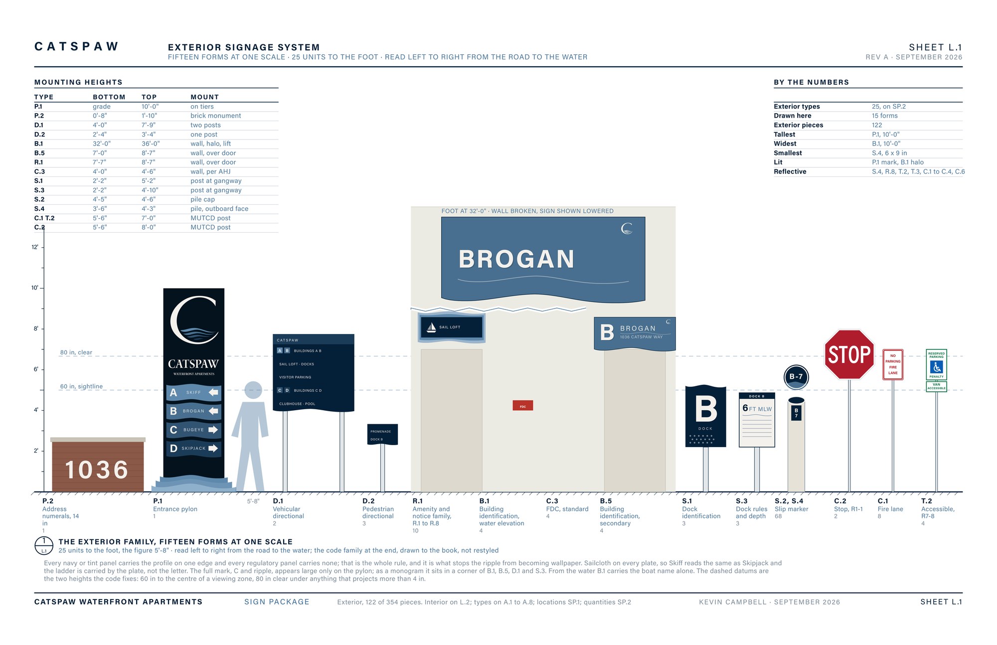
This is the page to judge the family on. Every exterior form drawn at the same scale on one ground line, so the ten foot pylon and the six by nine inch slip marker can be compared without lying to each other. The dashed datums are the two heights the code fixes: 60 in to the centre of a viewing zone, 80 in clear under anything that projects more than 4 in. The mounting heights table beside it is what a fabricator quotes from.
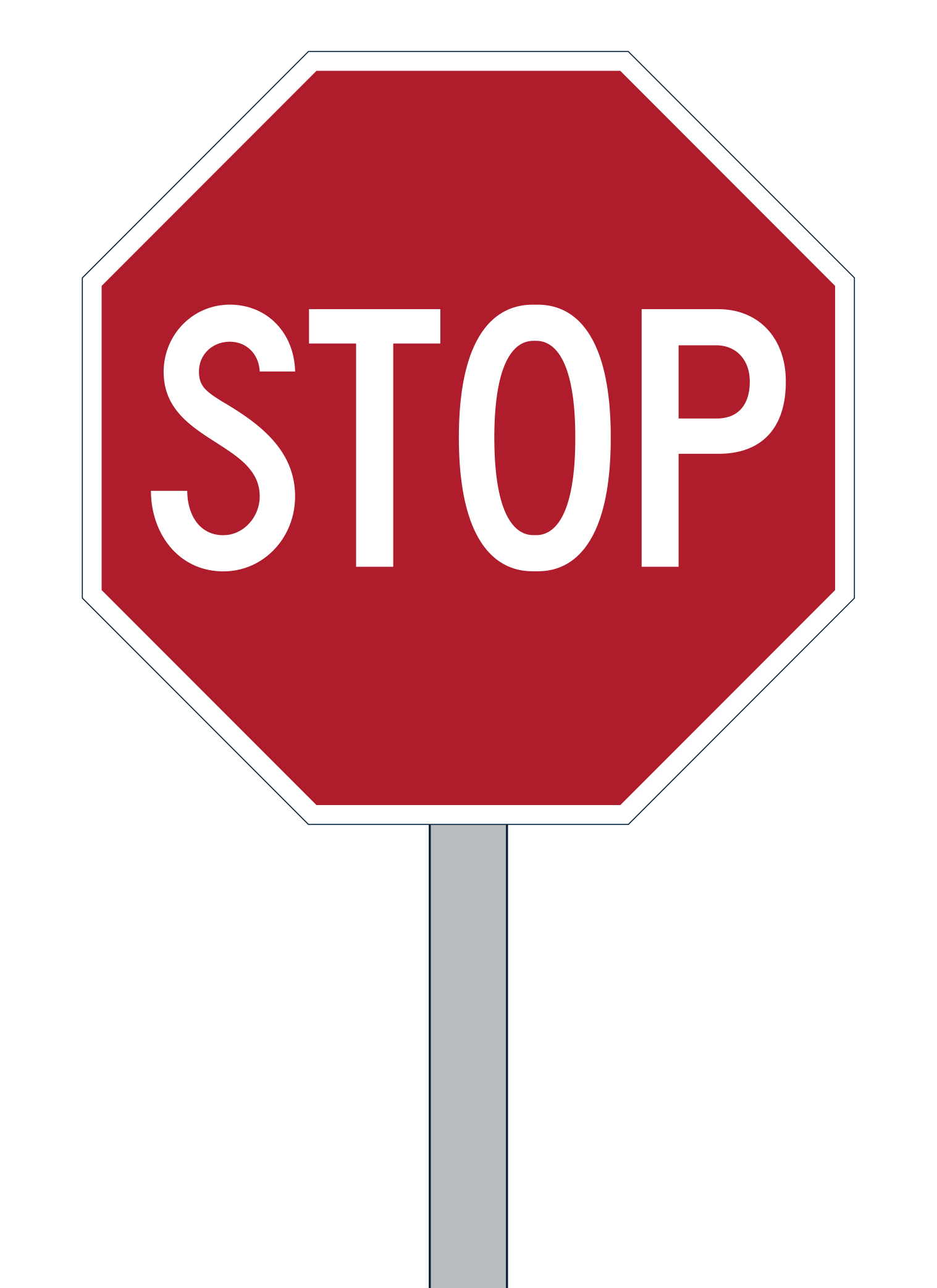
The code family sits at the far right, drawn to the MUTCD book and not restyled: the stop, the fire lane, the accessible parking plate with its van rider. They carry no ripple on purpose.

The pylon
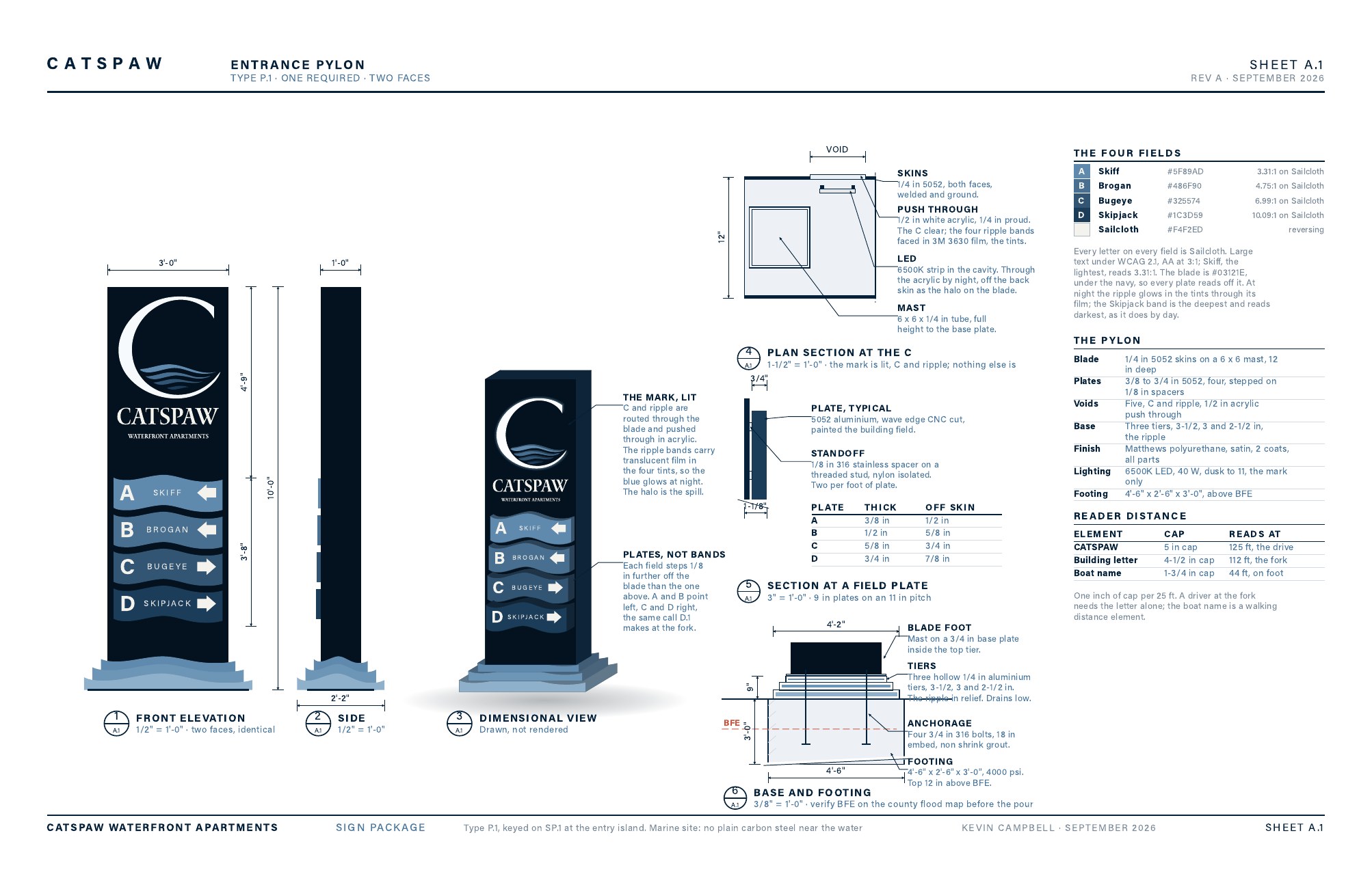
One inch of cap height per 25 ft is the rule the whole package sizes by. Each building plate steps an eighth of an inch further off the blade than the one above it, A and B pointing left, C and D pointing right, the same call the vehicular directional makes at the fork.
The blade is quarter inch 5052 skins on a six by six mast, the mark routed through and pushed through half inch acrylic, the ripple bands faced in translucent film in the four tints. At night the C is clear and the ripple glows. The footing is 4'-6" by 2'-6" by 3'-0" with the top twelve inches above base flood elevation, and the sheet says to verify BFE on the county flood map before the pour, because a marine site is not the place to assume.
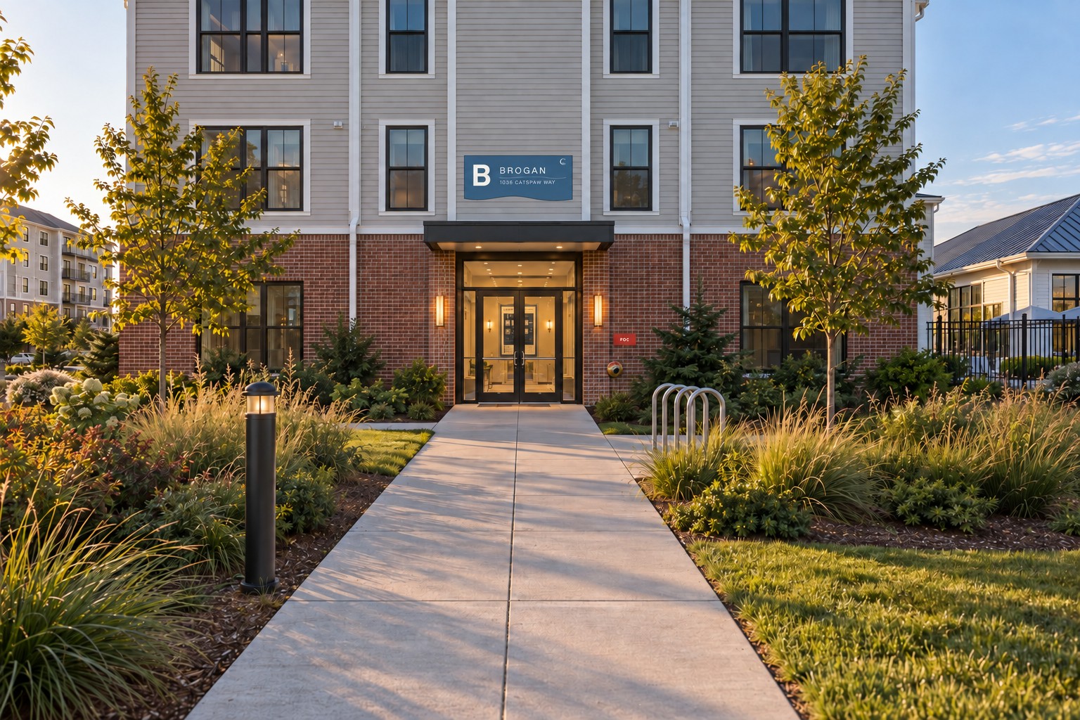
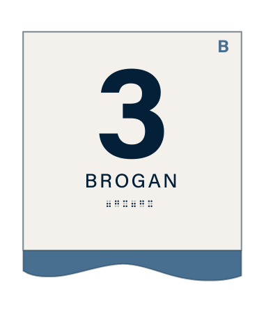
Building B from the walk. B.5 at the door and C.3 beside it, placed from the drawings to scale against a 7 ft door.
Building identification, two readers
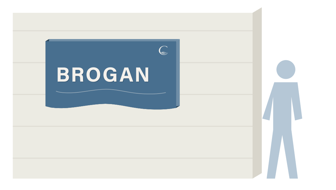
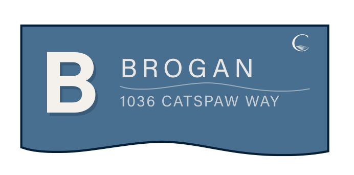

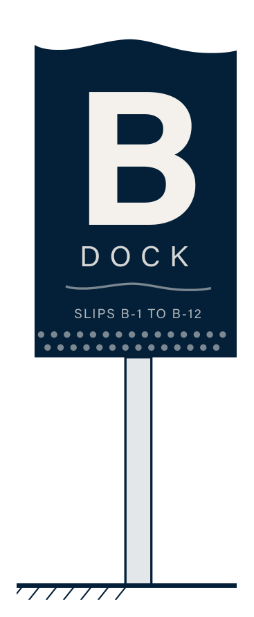
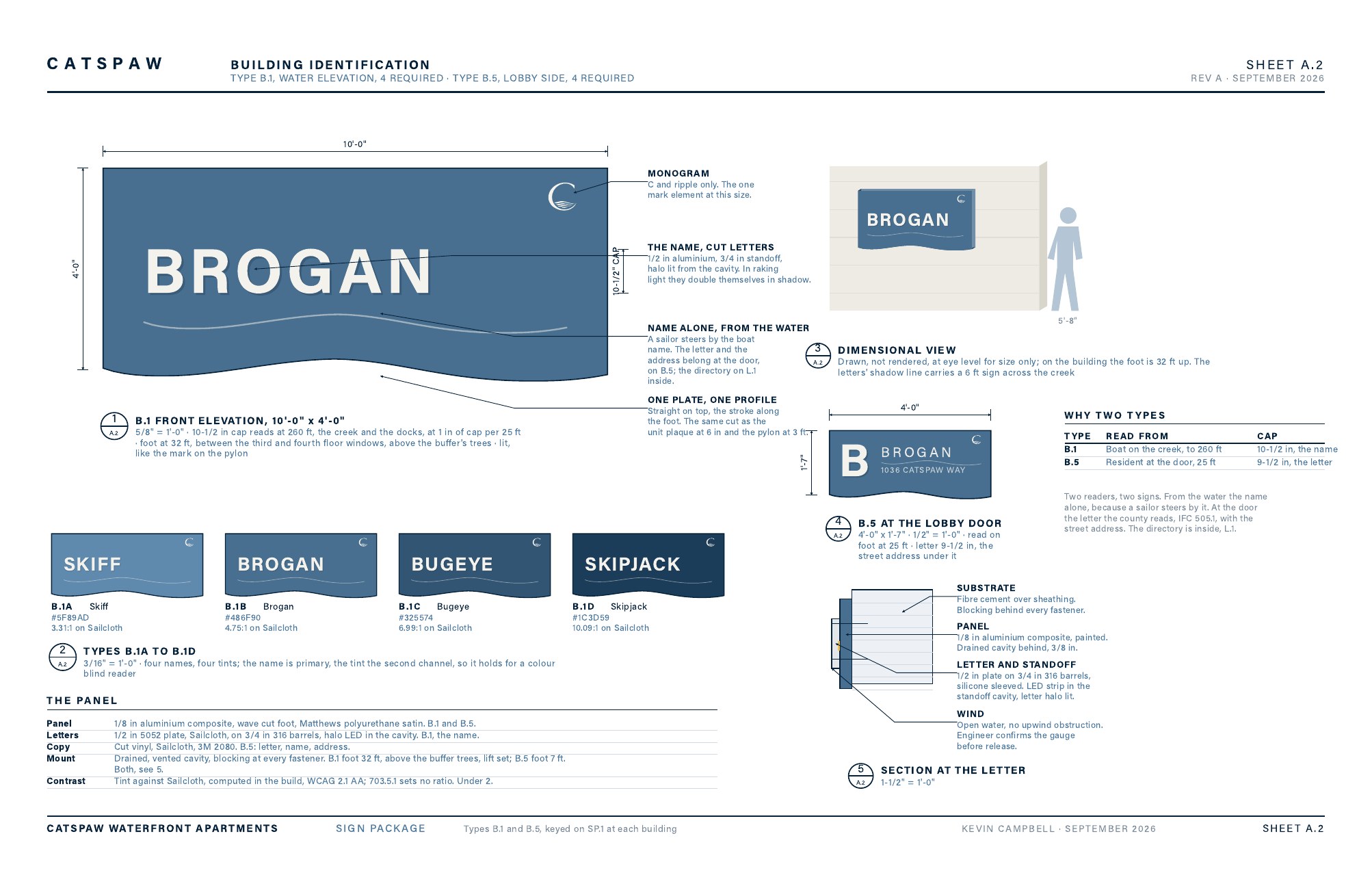
Two readers, two signs. From the water a sailor steers by the boat name, so B.1 carries the name alone at a 10-1/2 in cap, which reads at 260 ft, across the creek and the docks. Its foot is at 32 ft, above the buffer's tree canopy, the letters halo lit from the cavity so that in raking light they double themselves in shadow.
At the door a resident reads the letter, which is what the county reads too, so B.5 carries the letter at 9-1/2 in with the name and the street address under it.
Room identification, measured
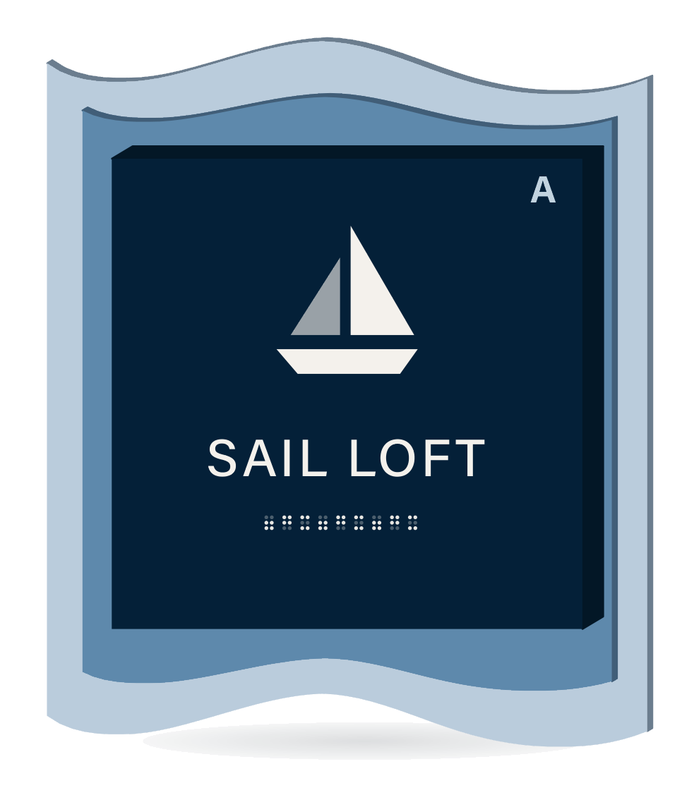
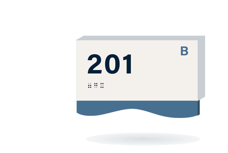
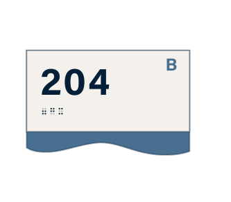
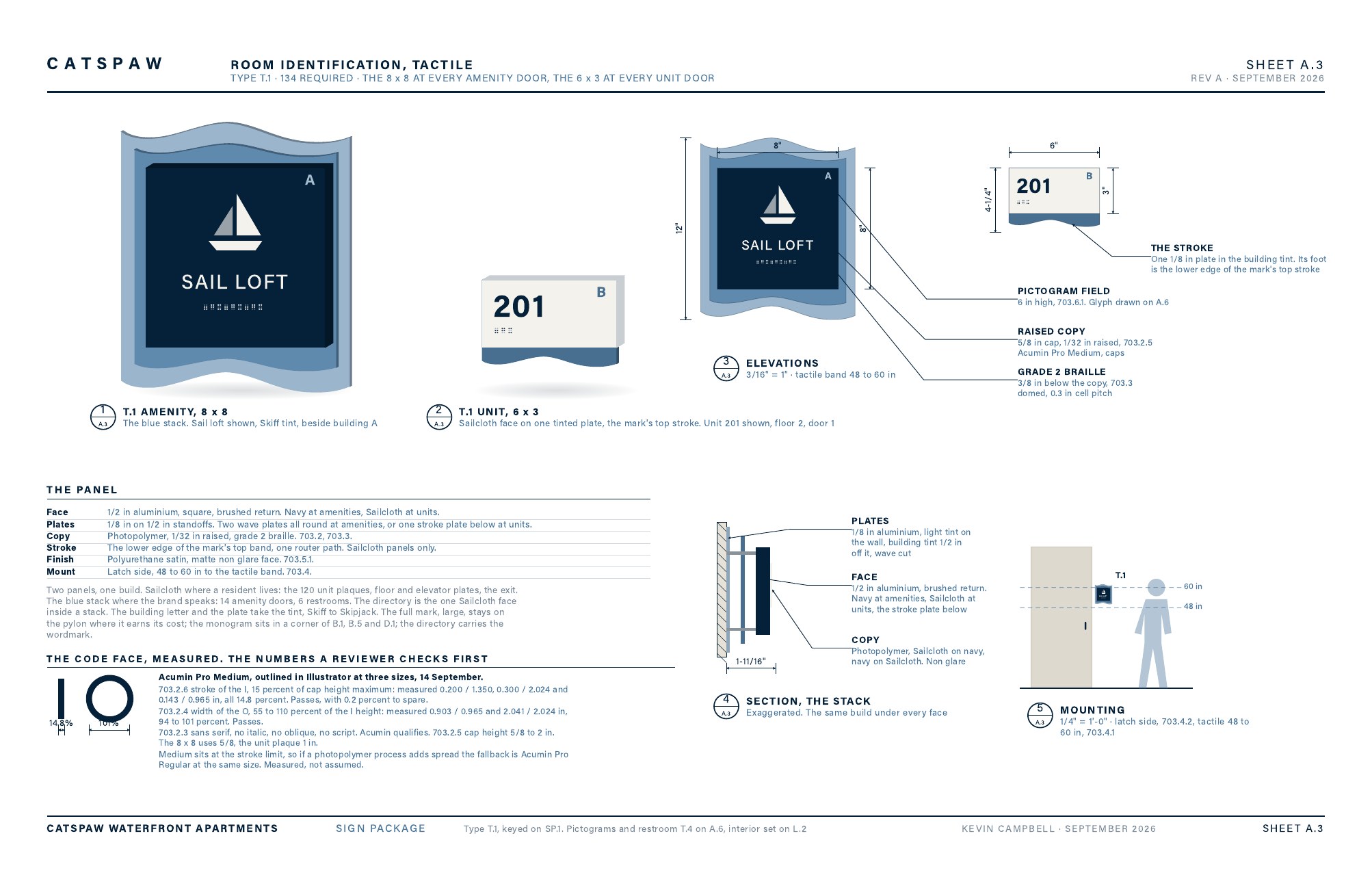
Two panels, one build. The navy stack where the brand speaks, at the amenity doors and restrooms, and the Sailcloth face where a resident lives, on one tinted stroke plate. The tactile copy is Acumin Pro Medium, and the sheet shows the numbers a reviewer checks first: stroke width 14.8 percent of cap height against a 15 percent maximum, measured at three sizes in Illustrator with 0.2 percent to spare, and the width of the O at 94 to 101 percent of the I height.
Medium sits at the stroke limit, so the sheet names the fallback if a photopolymer process adds spread.
Directional, for a driver and for a walker
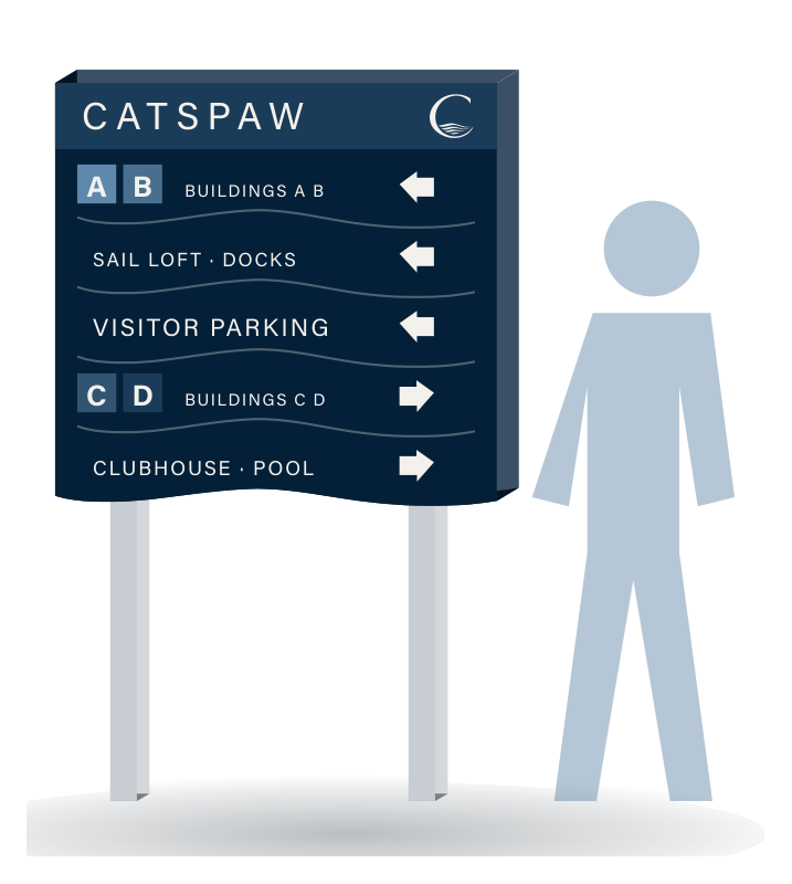
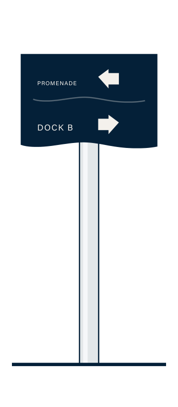
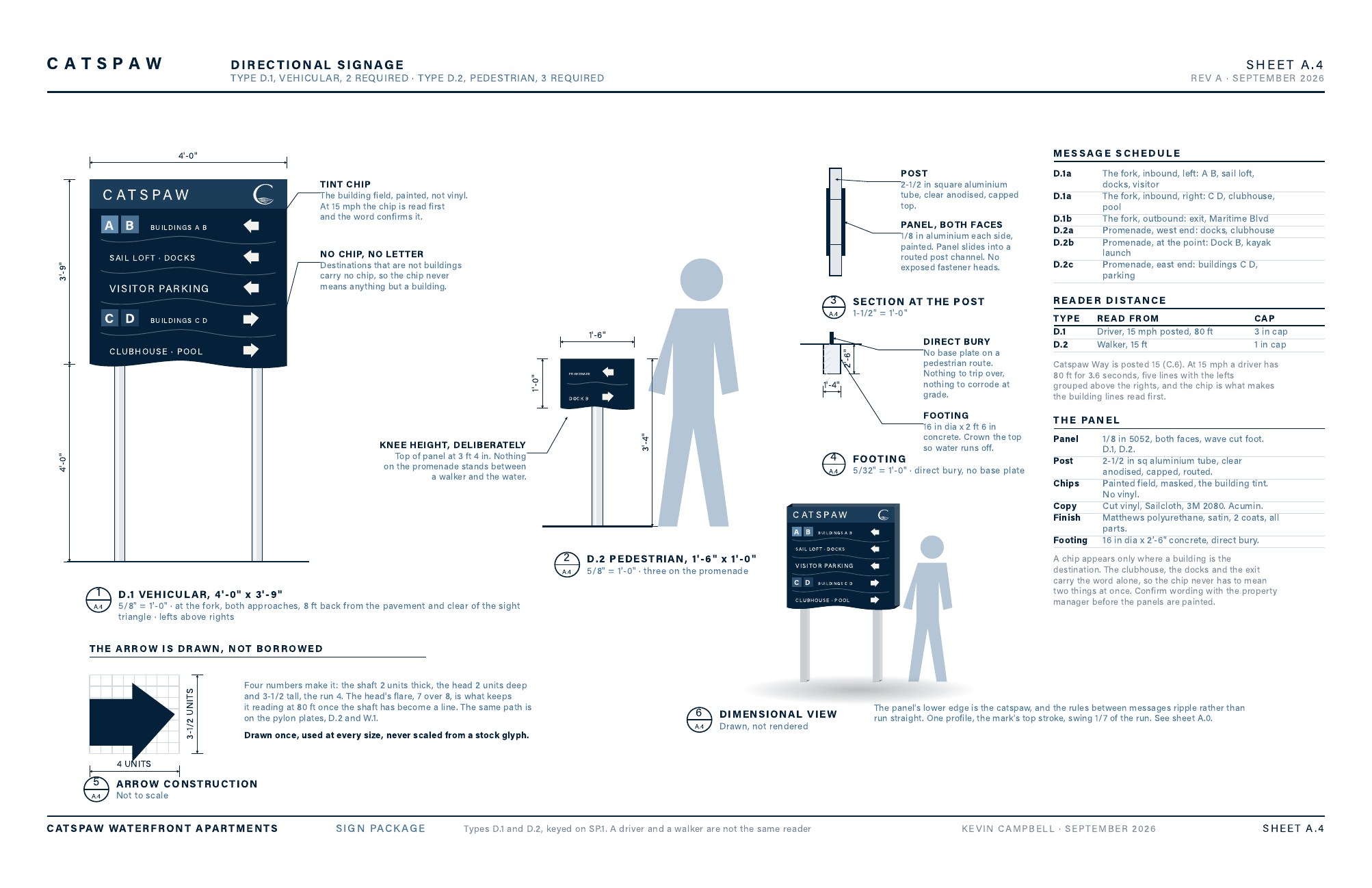
Catspaw Way is posted at 15. At 15 mph a driver has 80 ft for 3.6 seconds, so the vehicular directional carries five lines with the lefts grouped above the rights, and the building chip is what makes the building lines read first. A chip appears only where a building is the destination; the sail loft, the docks and the clubhouse carry the word alone, so the chip never has to mean two things at once. The pedestrian directional tops out at 3'-4", because nothing on the promenade should stand between a walker and the water.
The arrow is drawn, not borrowed: shaft two units, head two units deep and three and a half tall, run four, the head's flare seven over eight so it still reads at 80 ft once the shaft has become a line.
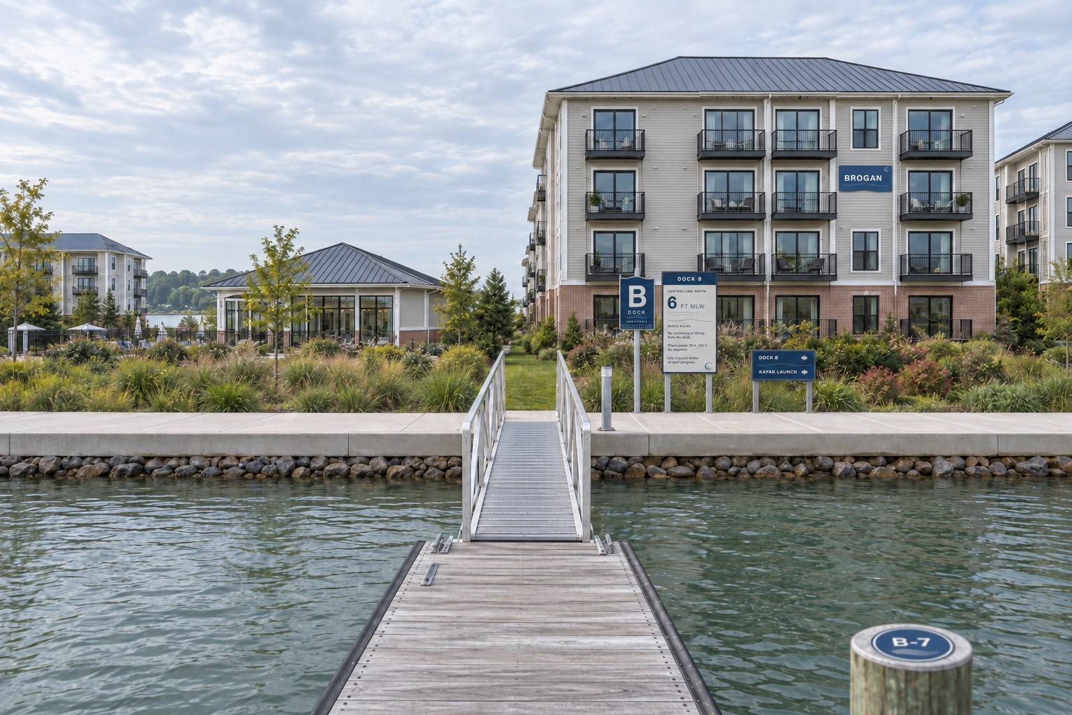
Looking south at Brogan. B.1 on the water elevation, D.2 on the promenade, S.1, S.2 and S.3 on the dock.
Dock and slip
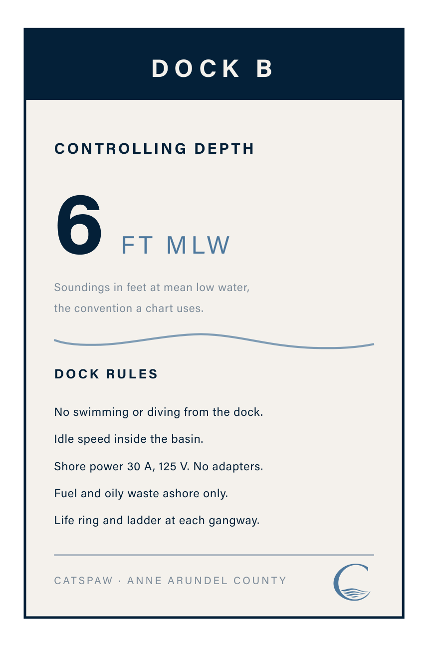
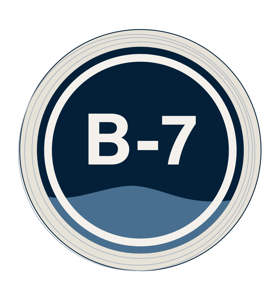
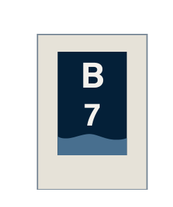
The slip marker is a 10 in cast aluminium disc seated flush in the timber pile cap, engraved and epoxy filled, with a retroreflective rim so a boat coming in after dark picks the number up in a handheld beam. It was the sign I was happiest with until I read it from the water and realised the boat sees the pile before the cap. So S.4 was added: a 6 by 9 in reflective plate on the outer pile's outboard face, 4 ft above the deck, one per slip, read from the fairway.
Slips take the dock letter as a prefix and number continuously, so no two slips on the site share a number. Apartments take the building letter. B-7 is a slip and B-204 is a unit, and nothing on the property resolves two ways over a radio or a phone. Salt water rules the materials: 316 stainless or marine aluminium, every stainless fastener through an aluminium part isolated with a nylon washer and sleeve, because the galvanic couple is what fails first.
Restrooms and the pictogram set
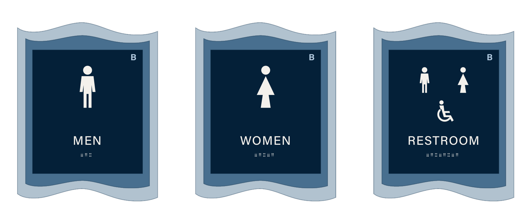

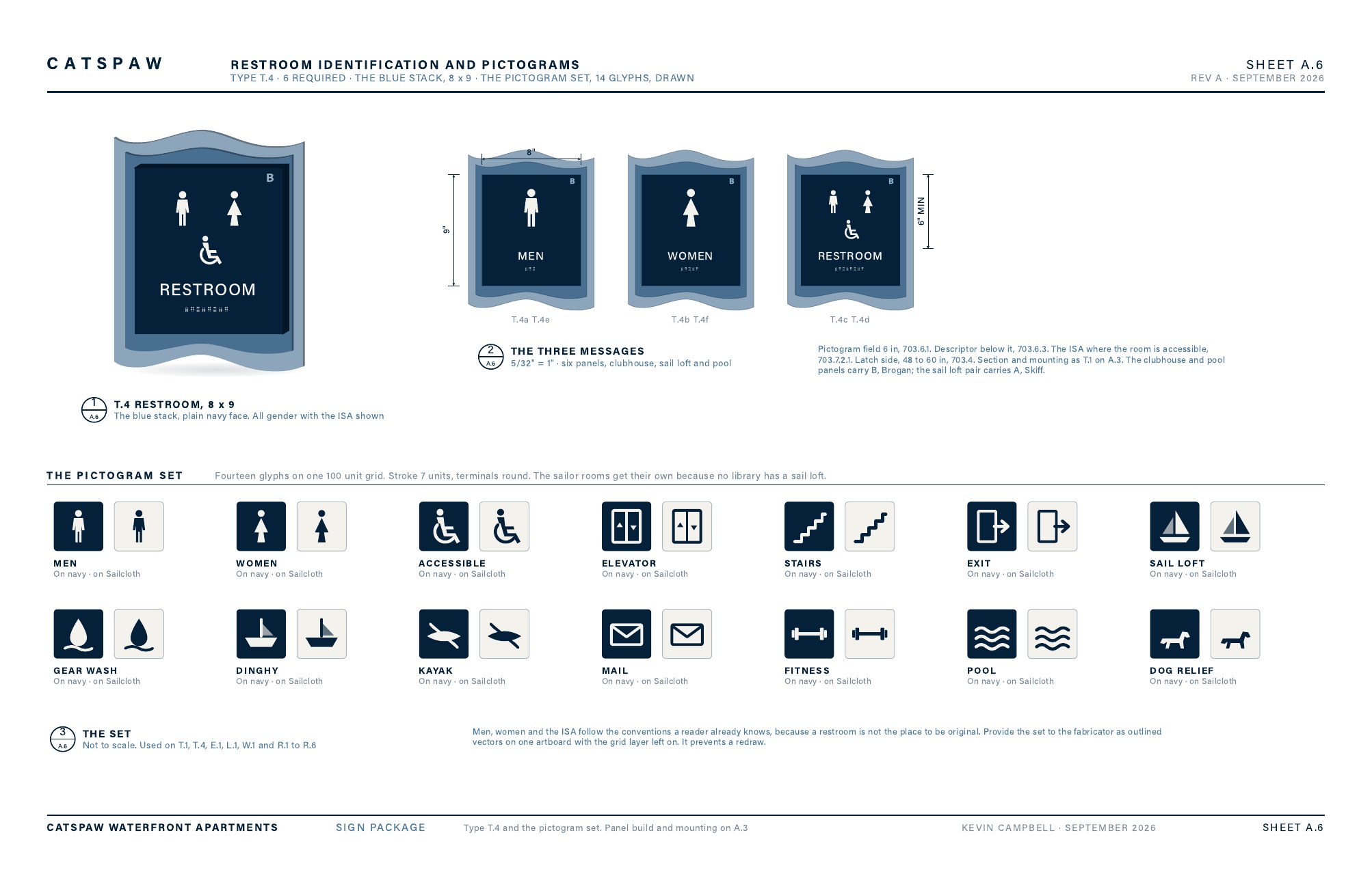
Men, women and the ISA follow the conventions a reader already knows, because a restroom is not the place to be original. The sailor rooms get their own glyphs, sail loft, gear wash, dinghy, kayak, because no library has a sail loft. Fourteen glyphs, stroke seven units, terminals round, provided to the fabricator as outlined vectors on one artboard with the grid layer left on, so nobody redraws them.
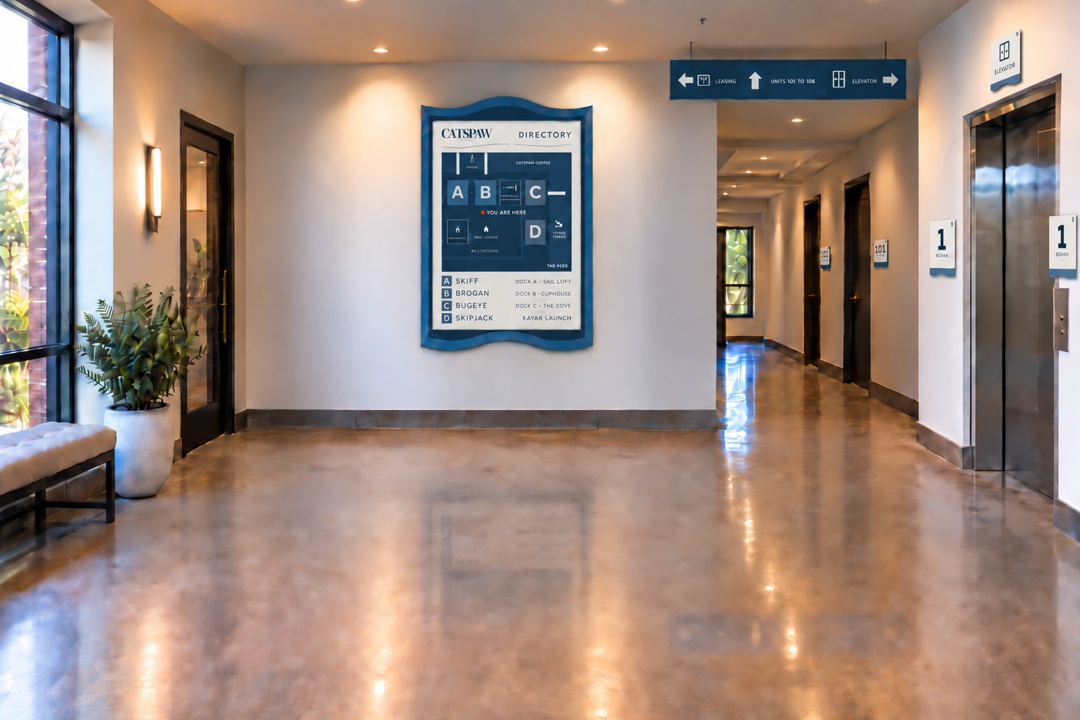
L.1 on the wall, W.1 overhead, E.1 at the elevator, T.1 at the first door.
Inside the lobby
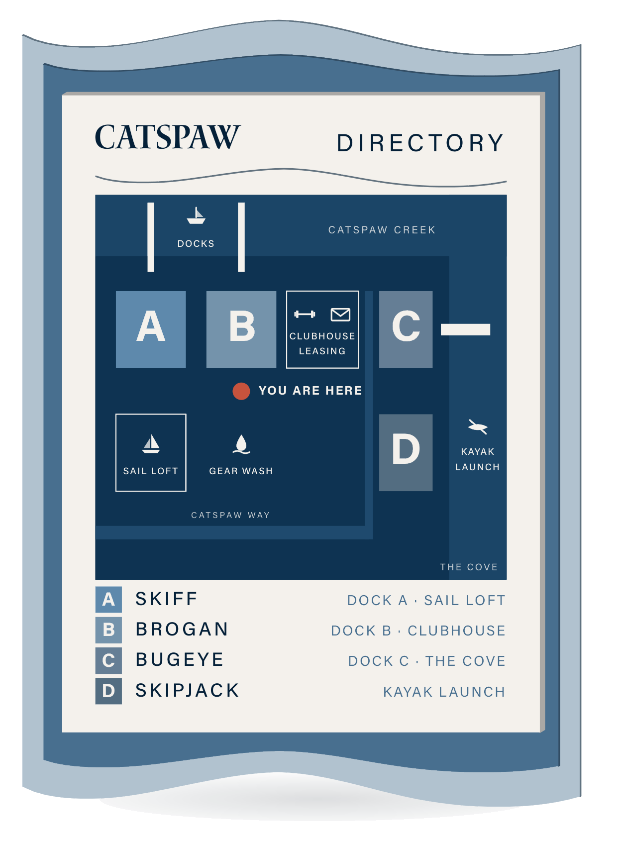
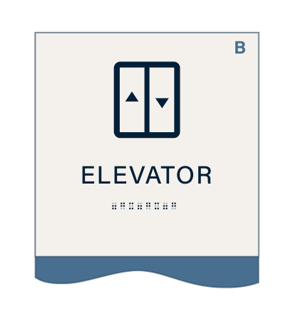
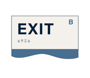
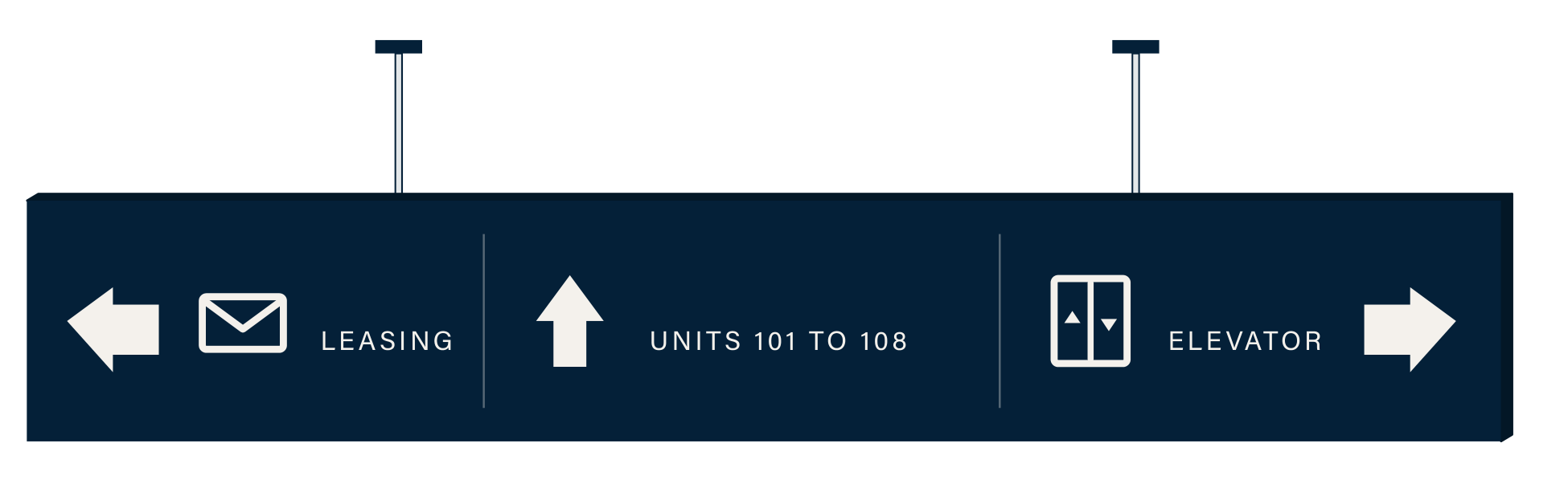
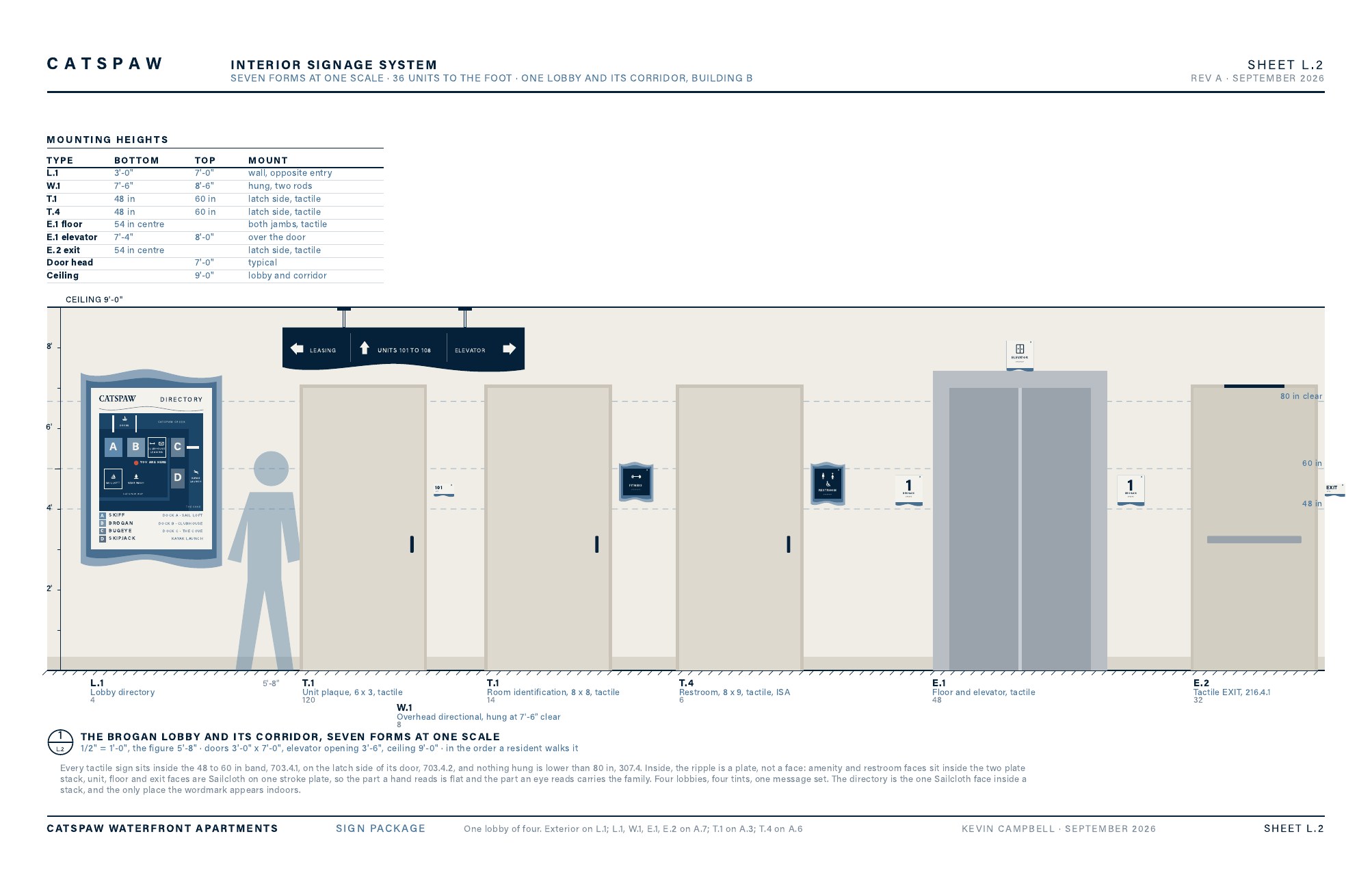
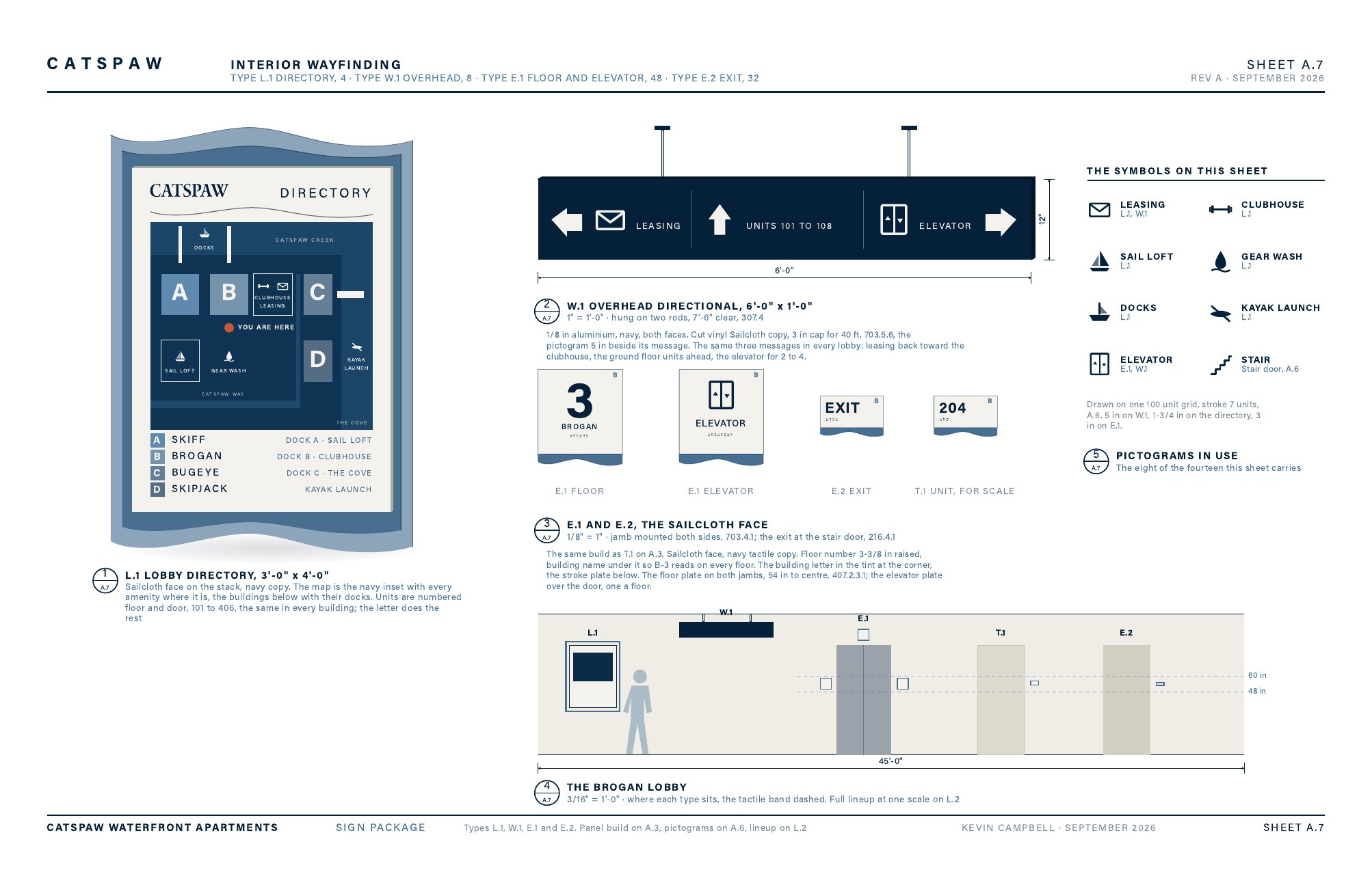
The directory is the one Sailcloth face inside a navy stack, and the only place the wordmark appears indoors. Its map is the site plan reduced to what a resident needs: the four buildings, the docks, the amenities, a you-are-here. Units are numbered floor and door, 101 to 406, the same in every building, eight to a floor and six on the top, so the building letter and the floor plate carry the rest and the overhead directional only has to say UNITS 101 TO 108, LEASING and ELEVATOR.
Every tactile sign sits in the 48 to 60 in band on the latch side of its door. The floor plate is on both elevator jambs at 54 in to centre, and a second plate over the door, one a floor, because a person stepping out of an elevator looks up before they look sideways.
Amenities and notices

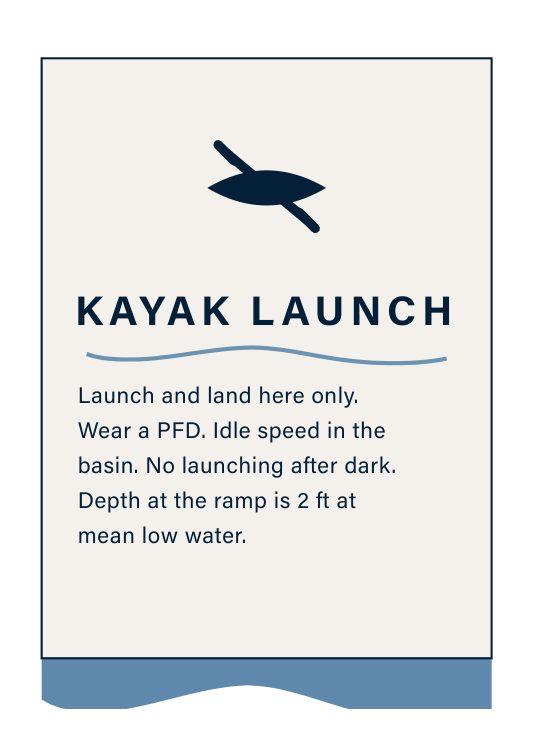
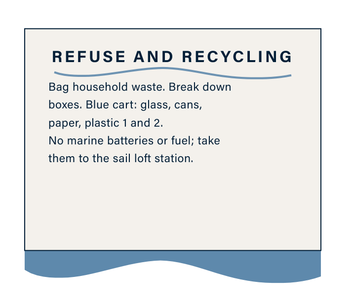
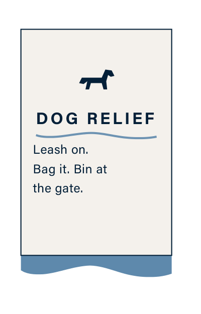
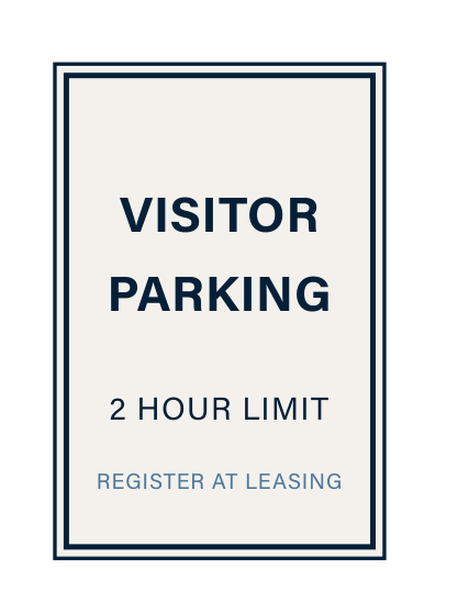
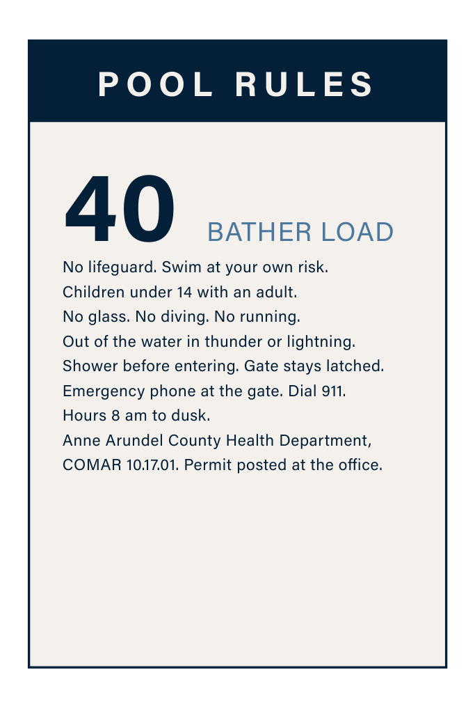
The identification stacks and the small notices carry the profile because they are ours. The pool rules and the visitor plate carry none, because a rule is not brand territory. The pool panel is set as designed copy rather than pasted in, with the COMAR citation and the bather load, because the panel nobody wants to design is the one worth designing.
The schedule
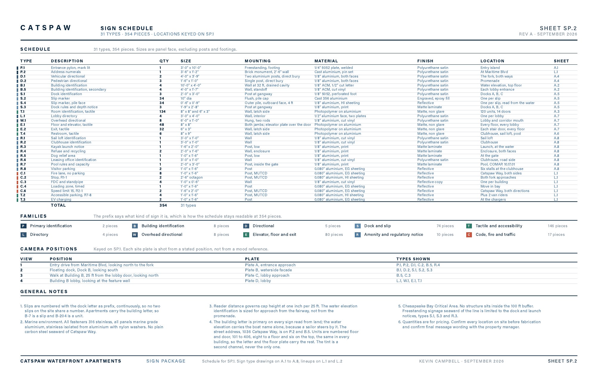
Every type with its quantity, panel size, mounting, material, finish, location and the sheet it is drawn on. The families are the prefix letters, which is how a schedule stays readable at 354 pieces. The totals on this sheet are computed from the rows, not typed, and the counts on the cover, the contents, the lineups and the colophon are checked against them, because a package that disagrees with itself is the first thing a fabricator notices.
What is drawn and what is generated
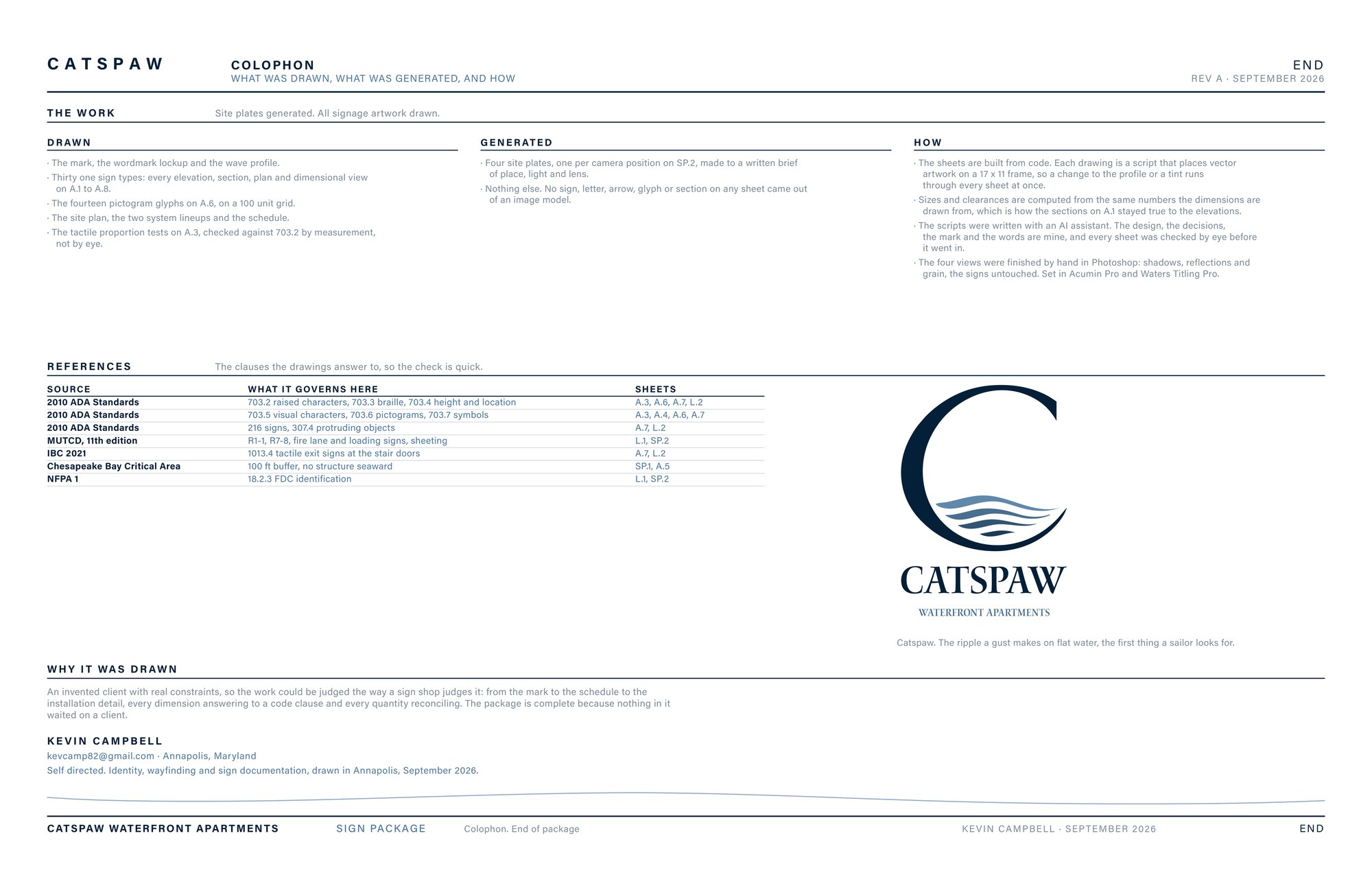
Every sign, letter, pictogram, section and view on the sheets is vector artwork drawn for this package. The sheets themselves are generated from scripts I wrote and direct, so a change to the profile or a tint runs through all 24 pages at once and the schedule recomputes. The four site plates are the only generated images, made to a written brief of place, light and lens, one per camera position, then finished by hand.
The clauses each type answers to are listed on the colophon: ADA 703 for the tactile and visual copy, the MUTCD 11th edition for the code family, IBC 1013.4 for the stair doors, NFPA 1 for the FDC, the Critical Area buffer for what can stand on the waterside.
What I would do differently
The unit numbering was rebuilt halfway through. The first scheme numbered units continuously and the overhead directionals were carrying ranges like 201 to 250, which is a sign asking a resident to do arithmetic in a corridor. Floor and door, 101 to 406, the same in every building, fixed the directional, the plaques and the directory in one move, and it should have been the first decision, not the tenth.
A public access boundary disc for the promenade was drawn, scheduled and then cut, because it was answering a question nobody on the site would ask. Cutting it moved eight numbers across six sheets, which is the argument for computing counts instead of typing them.
And the slip marker taught me to read every sign from where its reader actually stands. The disc in the pile cap is right for the person on the dock. The boat needed its own.
The documentation
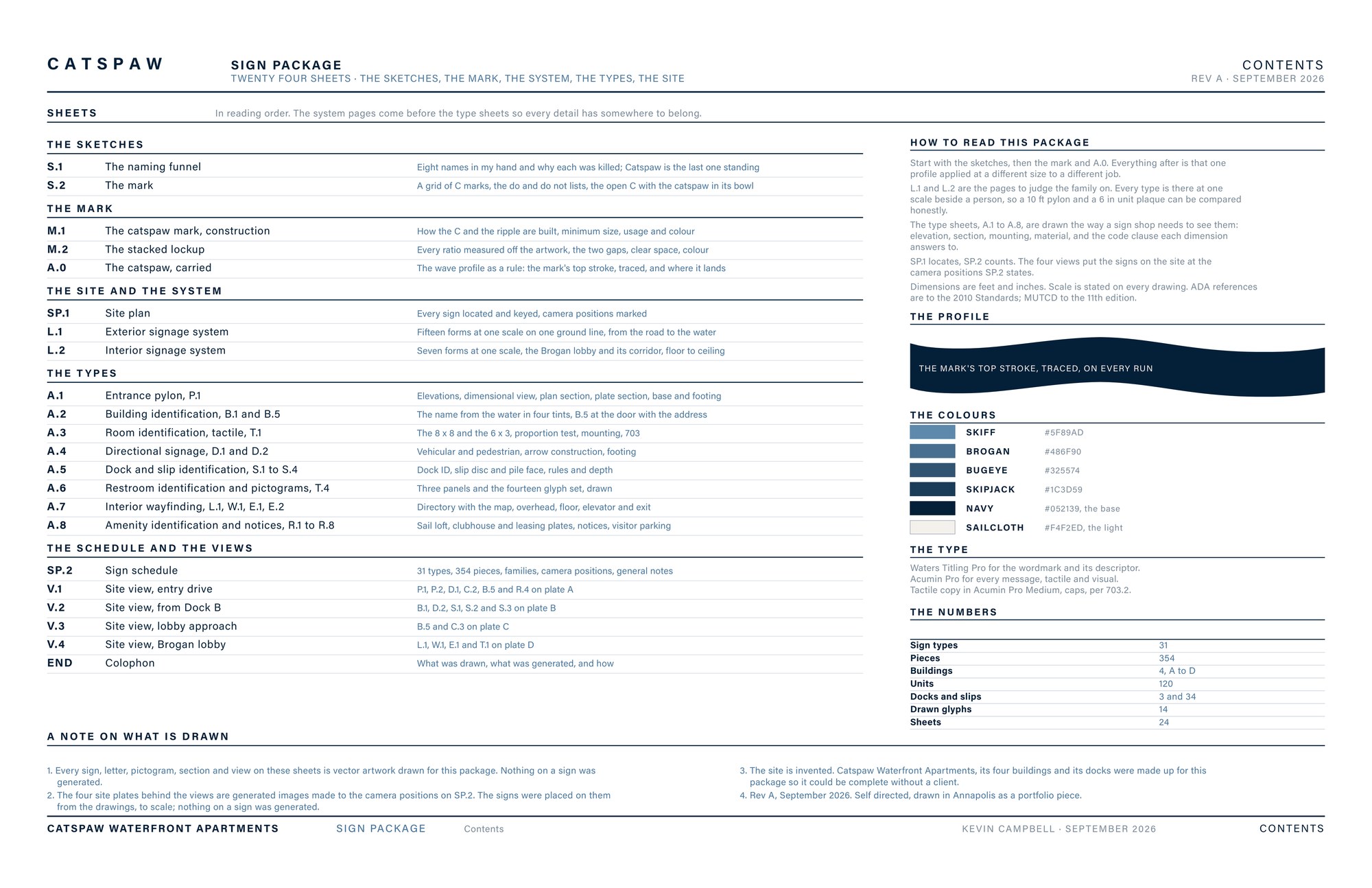

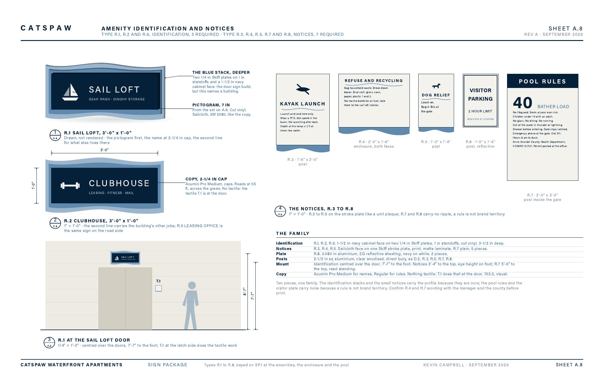
Sixteen of the twenty four sheets, 17 by 11: the profile, the site, the two systems, the eight type sheets, the schedule. The sketches and the views are above.