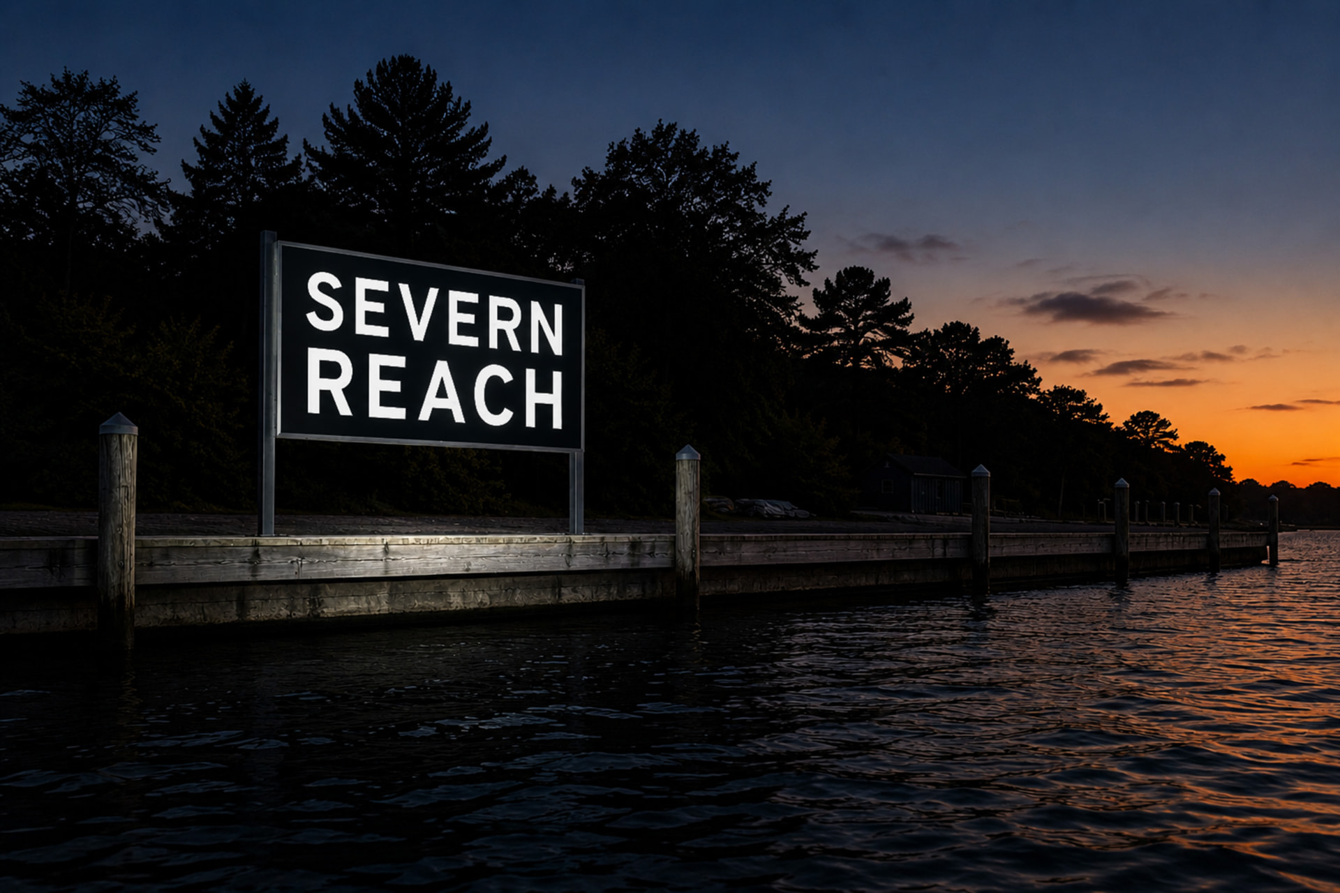
ID.1 at nautical twilight. Visualization: the sign artwork is the drawn file at true proportion, the setting is a composite.
Sixteen sign types for a marina that does not exist
Everything about the site is invented. Nothing about the constraints is. The dimensions, the materials, the fastener spec and the code references are real, and the package is drawn the way a real one is drawn.
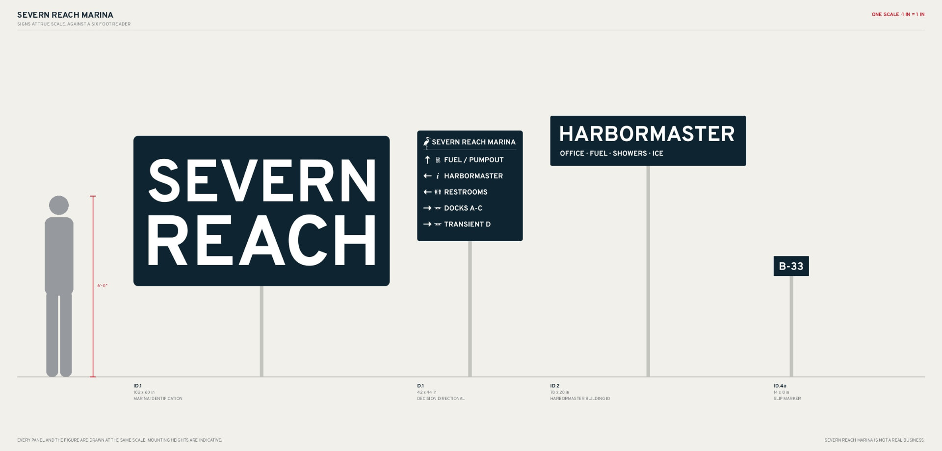
270 pieces across 349.57 square feet, on ten documentation sheets. What follows is the order a boater meets them, arriving from the water.
Every panel and the reader, at one scale.
The constraint
Three directions, three speeds, and the one that happens in the dark
A marina is the only wayfinding system whose users arrive from three directions at three speeds, and the arrival that matters most happens in the dark.
A transient boater has never been here. They are on a moving platform in wind and current, one hand on the throttle, looking for the fuel dock and a slip number they were given over the radio. The office closed an hour ago. Meanwhile a slipholder who knows the place cold is walking up from the parking lot needing nothing, and at two in the afternoon in July a family is walking the same pier next to a fuel truck and a dockhand with a cart.
Every sign has to serve the stranger without shouting at the regular.
Design a system a stranger can use at night, from the water, with nobody to ask.
Internally illuminated signage is the obvious answer. It fails here for three reasons.
It blinds the person it is trying to help. A lit sign face at 30 yards destroys a boater's dark adaptation at the exact moment they are judging closing distance to a piling. The sign becomes readable and the piling becomes invisible.
It puts power on a floating structure. Finger docks rise and fall with the tide and ride out wind tide and surge well past it. Power to a floating dock means marine-grade flexible conduit, GFCI protection, and a permanent failure point over salt water.
It fails as a unit. When the transformer dies the sign goes black, which is worse than an unlit sign, because a black sign looks like no sign and nobody reports it.
Everything water-facing is retroreflective instead. ASTM D4956 Type XI prismatic sheeting, which returns roughly twice the light of Type IV. The boater's own spotlight becomes the light source, no power touches the floating structure, and it degrades gracefully: the sheeting dims over years, it does not switch off.
The field stays dark and the legend lights out of it
The intuitive way to build a reflective sign is a white reflective field with a dark legend, the way a speed limit sign works. On the water that fails for the same reason the lit sign did. A full sheet of Type XI hit by a handheld spotlight at 25 yards is itself a glare source, and it costs the boater exactly the night vision the system exists to protect.
So only the characters are reflective. The field is dark and matte, and the legend lights up out of it. Highway guide signs are built this way for the same reason.
A display face was drawn for this panel and set aside on the same argument. Retroreflective sheeting returns light in proportion to area, so hairline joints vanish at 400 feet under a spotlight while thick strokes glow, and closed counters converge at identification distance. A display wordmark belongs on the burgee, the shirts and the web header, never on the sign read at 400 feet in the dark.
ID.1
102 in
60 in
ID.1
The sign you find in the dark
Seen from the creek channel at an assumed 400 feet, before anything else exists.
Panel
102 x 60 in
Margin
6.0 in
Corner radius
2.0 in
"SEVERN"
16.65 in cap
"REACH"
19.8 in cap
Reader distance
400 ft
Cap rule
Identification 1:25
Identification rule, 1 in of cap per 25 ft. the reader already knows the word and is confirming it.
Assumed identification sightline 400 ft from the creek channel. 400 / 25 = 16.00 in minimum cap. the sightline is a site condition and is stated as an assumption, not measured.
Each word is set at whatever cap fills the 90 in measure at natural width rather than being scaled to fit, so the two differ. Both clear the 16.00 in minimum.
At a 600 ft sightline the cap goes to 24 in and the panel to 11 ft 4 in, which the bulkhead structure would have to be designed for. see the sensitivity note.
Sheet 01 of 10
30 in
43.5 in
R.1
The first thing you tie up to
The fuel dock sits outside the fairways, so a boat fuelling never blocks a dock.
Panel
30 x 43.5 in
Margin
3.5 in
Corner radius
0.75 in
"NO SMOKING"
3.0 in cap
"NO OPEN FLAME"
2.0 in cap
"STOP ENGINES"
2.0 in cap
"1400 SEVERN REACH RD"
2.0 in cap
NFPA 303 sets a 2 in minimum block letter. every line on this panel is 2 in or greater. the code is a floor and the panel is sized to it, not the other way round.
NFPA 303 also requires the facility street address and an emergency number posted, so both appear here.
A fuel dock is an extra-hazard area and requires class b extinguishing capacity. coordinate extinguisher signage with the fire marshal.
Sheet 07 of 10
18 in
18 in
ID.3a
Finding your dock, from the water
The water face, set square to the channel approach rather than parallel to the pier.
Panel
18 x 18 in
Margin
1.5 in
Corner radius
0.75 in
"B"
6.0 in cap
Reader distance
40 ft
Cap rule
Decision 1:10
Quantity
4
Two faces, two orientations. the water face is set perpendicular to the channel approach, not parallel to the dock. a sign aligned to the dock presents its edge to the only reader who needs it.
Decision rule at a 40 ft reader distance. 40 / 10 = 4 in required, 6 in specified. the dock letter is the primary orientation cue and is deliberately oversized.
Water face legend is type xi retroreflective. pier face is non-reflective.
Sheet 03 of 10
14 in
6 in
ID.3b
The same dock, from the walkway
The pier face. Same letter at a third the cap height, because the reader is 15 feet away instead of 40.
Panel
14 x 6 in
Margin
1.9 in
Corner radius
0.25 in
"DOCK B"
2.0 in cap
Reader distance
15 ft
Cap rule
Decision 1:10
Quantity
4
Two faces, two orientations. the water face is set perpendicular to the channel approach, not parallel to the dock. a sign aligned to the dock presents its edge to the only reader who needs it.
Decision rule at a 15 ft reader distance gives 1.5 in. The NFPA 303 floor of 2 in governs instead, so 2 in is what is drawn.
Water face legend is type xi retroreflective. pier face is non-reflective.
Sheet 03 of 10
14 in
8 in
ID.4a
Finding your slip, from the water
On the outboard finger pile, retroreflective, read at 25 feet off a moving boat.
Panel
14 x 8 in
Margin
1.5 in
Corner radius
0.25 in
"B-33"
3.0 in cap
Reader distance
25 ft
Cap rule
Decision 1:10
Quantity
120
Two signs per slip. drawing 1 mounts on the outboard finger-pier pile. drawing 2 mounts at the inboard walkway edge. two readers stand in two different places.
Water face cap derived from a 25 ft reader distance at the decision rule of 1 in per 10 ft. required 2.5 in, specified 3 in. round up, never down.
Pier face computes to 0.8 in at an 8 ft reader distance. the NFPA 303 floor of 2 in governs instead, so 2 in is what is drawn.
Sheet 04 of 10
10 in
5 in
ID.4b
The same slip, from the pier
On the walkway side, not reflective, read at 8 feet on foot. 120 of each.
Panel
10 x 5 in
Margin
0.75 in
Corner radius
0.25 in
"B-33"
2.0 in cap
Reader distance
8 ft
Cap rule
NFPA 303 floor
Quantity
120
Two signs per slip. drawing 1 mounts on the outboard finger-pier pile. drawing 2 mounts at the inboard walkway edge. two readers stand in two different places.
Pier face computes to 0.8 in at an 8 ft reader distance. the NFPA 303 floor of 2 in governs instead, so 2 in is what is drawn.
Sheet 04 of 10
48 in
36 in
D.2
Where you stop and read
The board at the head of the walkway. North up, because a chart is north up.
Panel
48 x 36 in
Margin
3.0 in
Corner radius
1.0 in
"SEVERN REACH"
2.5 in cap
"VHF 09"
2.0 in cap
"HARBORMASTER"
0.5 in cap
"YOU ARE HERE"
0.5 in cap
Landside at the gangway head and at the lot. reader distance 3 ft.
Panel-governed, not reader-governed. legibility at 3 ft needs a 0.3 in cap. the panel is 48 in wide and a 0.3 in headline would look broken, so proportion governs.
Frame is tilted 15 degrees from vertical. a flat horizontal board mirrors the sky and goes white. a true vertical mirrors the reader.
Sheet 06 of 10
42 in
44 in
D.1
The fork in the walkway
Arrow, symbol, word, read in about two seconds by somebody walking.
Panel
42 x 44 in
Margin
2.5 in
Corner radius
1.0 in
"FUEL / PUMPOUT"
2.0 in cap
"HARBORMASTER"
2.0 in cap
"RESTROOMS"
2.0 in cap
"DOCKS A-C"
2.0 in cap
Decision rule at a 20 ft reader distance. 20 / 10 = 2 in cap. the reader is taking in information they have never seen and choosing between five options while walking.
Five destinations is a hard maximum. a sixth line means the sign is doing the job of two signs and neither well.
The arrow is constructed, not chosen. shaft width is the stem of the capital i in overpass bold, measured at 0.1850 of cap height.
Sheet 05 of 10
78 in
20 in
ID.2
Checking in
One word and the four services a stranger asks about over the radio.
Panel
78 x 20 in
Margin
4.4 in
Corner radius
0.75 in
"HARBORMASTER"
6.0 in cap
"OFFICE · FUEL · SHOWERS · ICE"
2.0 in cap
Reader distance
150 ft
Cap rule
Identification 1:25
Landside, non-reflective. no boater reads this sign and no night vision is at stake, so reflectivity is not spent here.
Identification rule at a 150 ft reader distance from the lot. 150 / 25 = 6 in cap.
Panel is the dark field, not shore. legend and service line are both white at 14.04:1. slate on a dark panel measures 2.89:1 and is banned system wide, which is why the service line is not set in it.
Sheet 02 of 10
30 in
28 in
R.1a
The alternate, where the rail is short
Half the base panel, for a dock rail that will not take 43.5 inches.
Panel
30 x 28 in
Margin
3.5 in
Corner radius
0.75 in
"NO SMOKING"
3.0 in cap
"NO OPEN FLAME"
2.0 in cap
"STOP ENGINES"
2.0 in cap
Reader distance
10 ft
NFPA 303 sets a 2 in minimum block letter. every line on this panel is 2 in or greater. the code is a floor and the panel is sized to it, not the other way round.
NFPA 303 also requires the facility street address and an emergency number. This alternate has no room for them, so they move to R.2a, which is specified as a required companion and never as an optional add.
A fuel dock is an extra-hazard area and requires class b extinguishing capacity. coordinate extinguisher signage with the fire marshal.
Sheet 07 of 10
40 in
14 in
R.2a
The companion that is never optional
Specified as required wherever the alternate is selected, because an optional emergency panel quietly never gets bought.
Panel
40 x 14 in
Margin
3.2 in
Corner radius
0.75 in
"EMERGENCY 911"
2.0 in cap
"1400 SEVERN REACH RD"
2.425 in cap
"HARBORMASTER 410-555-0140"
1.3 in cap
Reader distance
10 ft
NFPA 303 sets a 2 in minimum block letter. every line on this panel is 2 in or greater. the code is a floor and the panel is sized to it, not the other way round.
This panel carries the street address and emergency number NFPA 303 requires, which the short alternate has no room for.
A fuel dock is an extra-hazard area and requires class b extinguishing capacity. coordinate extinguisher signage with the fire marshal.
Sheet 07 of 10
12 in
9 in
T.1a
At arm's length
Read by touch. The only signs on the site the signage weight is unlawful on.
Panel
12 x 9 in
Margin
0.75 in
Corner radius
0.25 in
"RESTROOM"
1.0 in cap
Reader distance
3 ft
Cap rule
ADA 703.2
Quantity
4
ADA 703.2. raised characters 1/32 in minimum above their background, sans serif, uppercase, not italic or decorative.
Raised character height 5/8 in minimum to 2 in maximum. specified at 1 in.
ADA 703.2.4 requires the width of uppercase o to be 55 to 110 percent of the height of uppercase i. overpass regular measures 84.9 percent and passes. measured by rendering the glyphs and reading the ink.
Sheet 08 of 10
12 in
9 in
T.1b
The same rule, one door along
Identical construction, identical braille separation, one word different.
Panel
12 x 9 in
Margin
0.75 in
Corner radius
0.25 in
"LAUNDRY"
1.0 in cap
Reader distance
3 ft
Cap rule
ADA 703.2
Quantity
1
Construction, character height and braille separation as T.1a.
Sheet 08 of 10
12 in
9 in
T.1c
And the third
Three doors, one schema. The repetition is the specification.
Panel
12 x 9 in
Margin
0.75 in
Corner radius
0.25 in
"OFFICE"
1.0 in cap
Reader distance
3 ft
Cap rule
ADA 703.2
Quantity
1
Construction, character height and braille separation as T.1a.
Sheet 08 of 10
84 in
32 in
ID.0
Arriving the other way
The landside entrance, for the slipholder who came by car and needs nothing.
Panel
84 x 32 in
Margin
6.0 in
Corner radius
1.0 in
"SEVERN REACH"
6.0 in cap
"MARINA"
3.0 in cap
"VHF 09"
2.0 in cap
Reader distance
60 ft
Identification rule at 60 ft gives 2.4 in. Drawn at 6 in because the panel is the entrance mark and proportion governs, not the reader.
No sheet issued
48 in
40 in
V.1
The working side
Cut vinyl on a door that goes through a wash bay and a decade of UV.
Panel
48 x 40 in
Margin
4.0 in
Corner radius
1.0 in
"SEVERN REACH"
2.49 in cap
"MARINA"
1.25 in cap
"410-555-0140"
1.55 in cap
"1400 SEVERN REACH RD"
1.325 in cap
Cut vinyl, not a printed panel. cut vinyl survives the wash bay and a decade of UV. a printed wrap on a work truck is a three year item.
Panel-governed. legibility at a 15 ft reader distance needs a 0.6 in cap. the door is 48 in wide and the mark fills it, so the panel governs, not the reader.
Nothing crosses the body crease. a graphic that spans a crease reads as broken from every angle except straight on, and that is the one angle nobody sees it from.
Sheet 09 of 10
End of the collection
Sixteen types. 270 pieces. 349.57 square feet.
Every one located on the sign location plan, which follows.
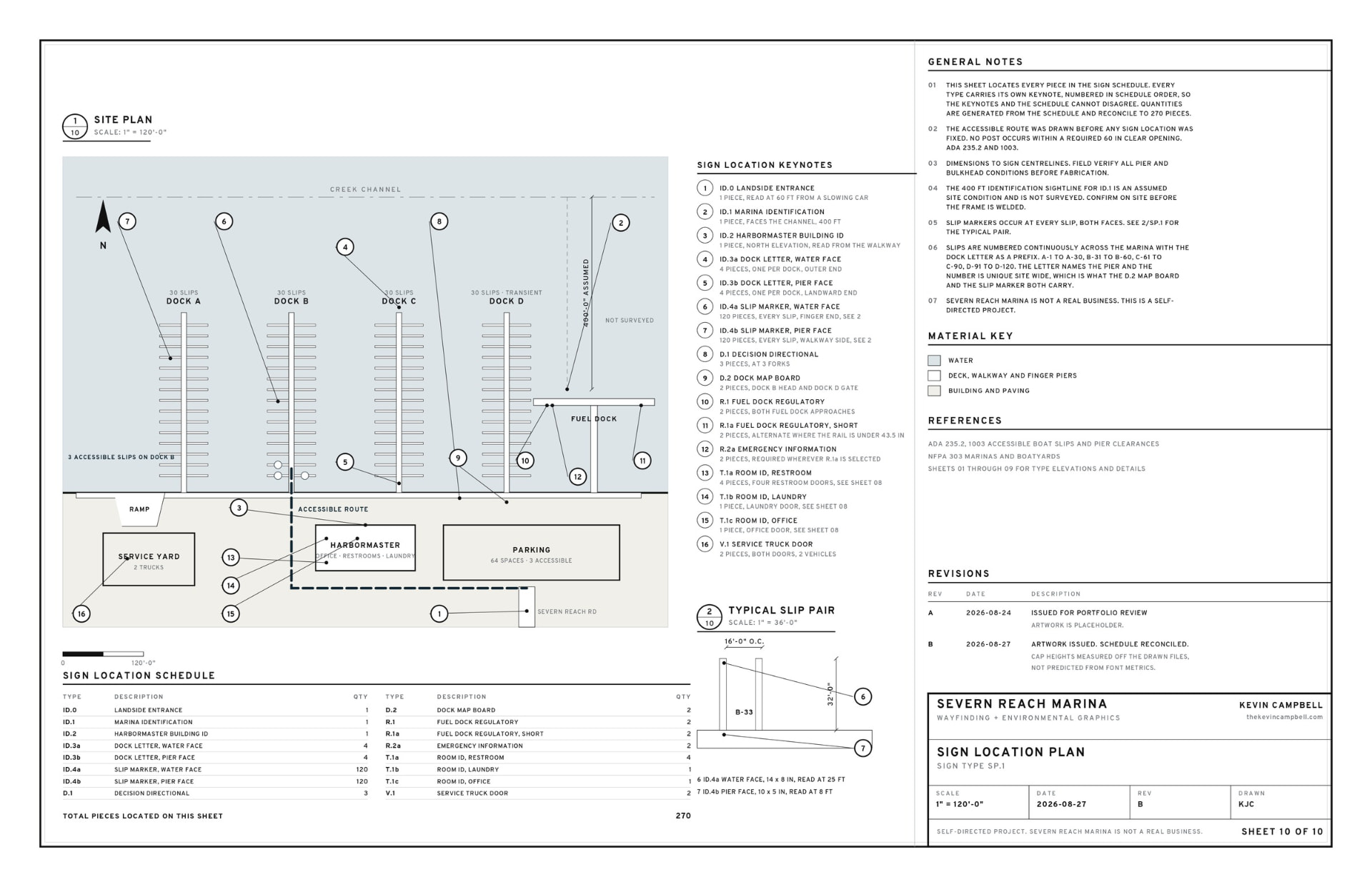
Every piece, where it goes
Every sign you just passed, located on the site it was drawn for. The plan and the schedule are generated from one file, so the build fails if the pieces located here do not reconcile to the count.
The slipholder who knows the place cold is walking up from the parking lot needing nothing. The landside entrance is identification: recognising a known shape at the edge of legibility is enough.
This type is drawn, scheduled and counted, and no documentation sheet was issued for it. That is stated rather than hidden, because a package that quietly implies coverage it does not have is the thing a reviewer catches.
The building identification carries the word a stranger is looking for and the four services they will ask about, at a cap height set by the identification rule instead of by what fits.
HARBORMASTER is the widest string in the package. Its characters average 0.976 of their own cap height in advance width, against 0.674 on the service line beneath it. At a 6 inch cap that puts the word at 69.1 inches of ink against a 69.2 inch clear measure, which is what forced this panel to 78.
A directional sign is read in about two seconds by somebody who is walking. Arrow, symbol, word. Five destinations is a hard maximum, because a sixth line means the sign is doing the job of two signs and neither of them well.
Adding a symbol column forced the panel from 36 to 42 inches wide. The cap could not shrink to absorb it, since 2 inches is a floor set by the decision rule at a 20 foot reader distance. The width turned out to be free: ACM comes in 48 by 96 inch sheets, and both 36 and 42 yield two panels per sheet, so the extra six inches came out of waste that was already being thrown away.
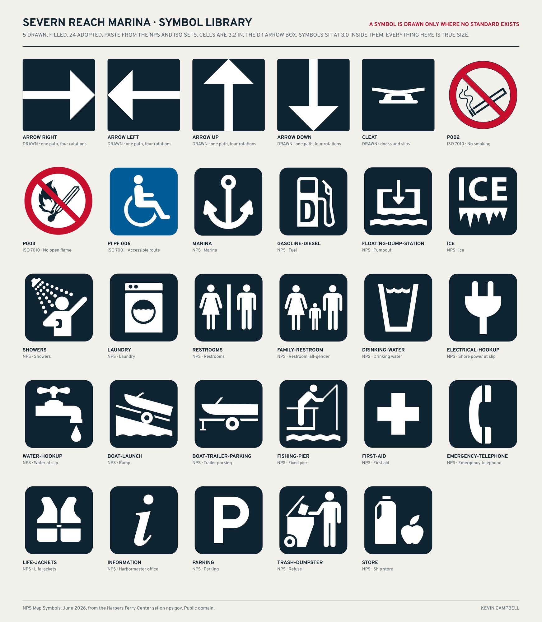
Twenty-four symbols in this package. Two of them are mine.
The prohibitions are ISO 7010 P002 and P003, specified by designation instead of redrawn. The services are National Park Service map symbols, which the NPS publishes in the public domain: marina, gasoline-diesel, ice, showers, laundry, restrooms, drinking water, electrical hookup, water hookup. Those last two are the ones an invented set would miss, because shore power and water at a slip are the two things a transient asks about over the radio.
A UI icon library would have been the easy source and the wrong one. Those are drawn for 24 pixels on a screen, with stroke weights and detail that fall apart on a panel read from a moving boat. NPS symbols are drawn for outdoor identification at distance, which is the same problem this package is solving, and they are public domain from nps.gov.
Two services have no standard symbol anywhere, pumpout and VHF monitoring, and both stay as words. Symbols carry the map board and the landside directionals, where a reader is standing still and scanning a list. Words carry the regulatory panels, because an instruction that has to be obeyed in seconds cannot depend on a stranger decoding a glyph correctly the first time.
Both drawn symbols are constructed instead of chosen. The directional arrow's shaft width is the stem of the capital I, 0.1850 of cap height, measured off Overpass Bold. Head at 45 degrees, half-height three shaft widths, four rotations of one path. The arrow and the legend beside it therefore carry the same stroke weight and return the same amount of light.
Heads-up alignment tests better on you-are-here boards in general, and it is the wrong choice here. Boaters arrive having read a chart, and charts are north up. It also lets both boards carry one artwork instead of two mirrored ones.
The board is set at a 15 degree tilt so it does not mirror the sky. The slip count on it is checked by the build against the sign schedule, so a map that disagreed with its own numbers would fail before it rendered.
NFPA 303, the fire standard for marinas and boatyards, sets a 2 inch minimum block letter. Many states adopt it as code, so that is a legal floor. Treating a floor as a target is the mistake this system exists to avoid.
Cap height is set by reader distance instead, and there are two rules. Identification is 1 inch of cap per 25 feet, where the reader already knows the word and is confirming it. Decision is 1 inch of cap per 10 feet, where the reader is taking in something they have never seen and acting on it inside a couple of seconds. That needs comfortable legibility, not maximum legibility.
A marina name is identification. A slip number is a decision. They are not the same problem and they do not get the same ratio.
Every slip gets two signs because two readers stand in two different places: one on a boat off the outboard end of the finger pier, one walking the inboard walkway. Different size, different mounting, different material. The water face is retroreflective. The pier face is not. At 240 pieces it is the highest quantity type in the package, which makes it the most expensive thing to get wrong.
The fuel dock regulatory content is drawn two ways. The base is a single 30 by 43.5 inch panel. The alternate splits it across a 30 by 28 regulatory panel and a 40 by 14 emergency companion. Both are drawn to the same standard, because an alternate a contractor cannot price is not an alternate.
The base is what I would specify. One substrate means the address and the emergency number cannot be separated from the prohibition, and those are the lines a fire marshal checks. The alternate exists for a real condition: a dock rail that will not take a 43.5 inch panel.
Where it is selected, the emergency panel is specified as a required companion and never as an optional add, because the failure mode of an optional emergency panel is that it quietly never gets bought.
Both are drawn, scheduled and priced at quantity 2 each, and in a construction set an alternate is a deliverable the owner selects. A rejected option is the designer thinking out loud. An alternate is a priced choice handed to the client.
The weight that is legal at 400 feet and illegal here
Every other sign in this system is set in Overpass Bold. ADA 703.2.5 caps the stroke of the uppercase I at 15 percent of character height. Measured by rendering the glyph and reading the ink, Overpass Bold is 18.50 percent. The signage weight is unlawful on a tactile sign.
Medium clears the limit at 14.43 percent and Regular clears it at 12.43. Regular is specified, and the reason is inspection margin: half a percentage point is inside the variation between a screen rendering and a routed photopolymer face, and this is a dimension somebody checks with calipers.
There is no pictogram on these signs. ADA 703.6.1 requires a pictogram field of 6 inches minimum and forbids characters and braille inside it, and in a 9 inch panel that leaves no lawful room for a 1 inch cap, a 3/8 inch separation and a line of braille. The accessibility symbol is different, since 703.7.2.1 treats it as a symbol of accessibility and not as a pictogram, so it appears on the restrooms and nowhere else.
Where a stainless fastener passes through an aluminum panel, a nylon washer under the head is not sufficient, and it is the commonest error in a marine spec. The head gets isolated and the shank and threads still bear on the bore, completing the galvanic circuit through the exact path the washer was meant to break. The spec calls a shoulder bushing that isolates the head and the shank together.
316 stainless throughout, not 304, because the molybdenum is what resists chloride pitting and 304 is the default a sign shop reaches for. HDPE on the floating docks instead of aluminum composite, because a scraped HDPE edge shows the same colour underneath and a scraped ACM edge wicks and delaminates. And it floats, so a sign knocked off a piling is recoverable.
None of that is visible in any render. It is what a production manager reads.
V.1
The identity
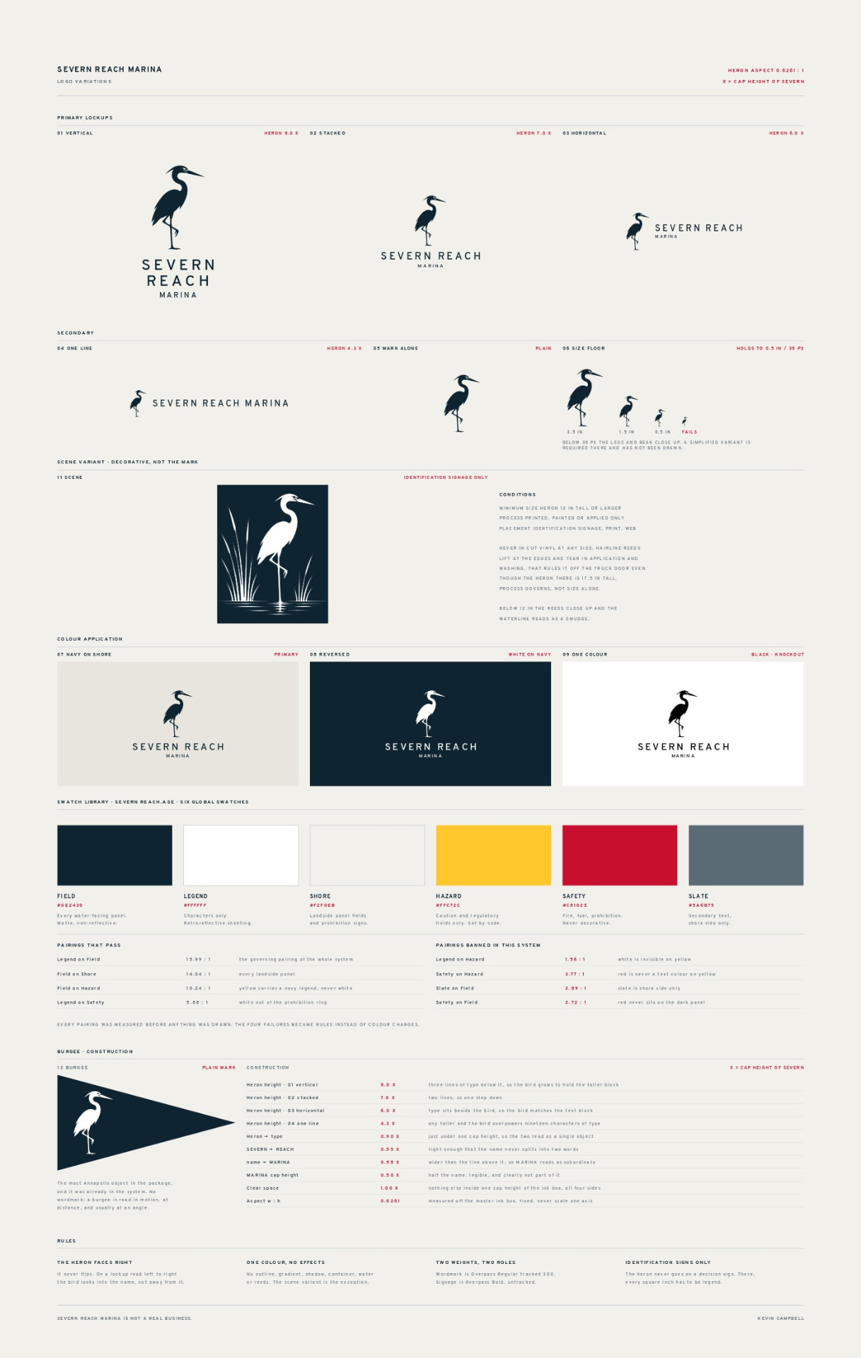
One mark, six ways it has to survive
Full lockup down to the burgee. A marina mark is stitched on a flag, routed into a monument sign, cut in vinyl on a truck door and rendered half an inch tall on a slip marker, so the system is drawn as a ladder of reductions rather than one logo scaled down.
The colour rules
Four combinations that pass, four that are banned
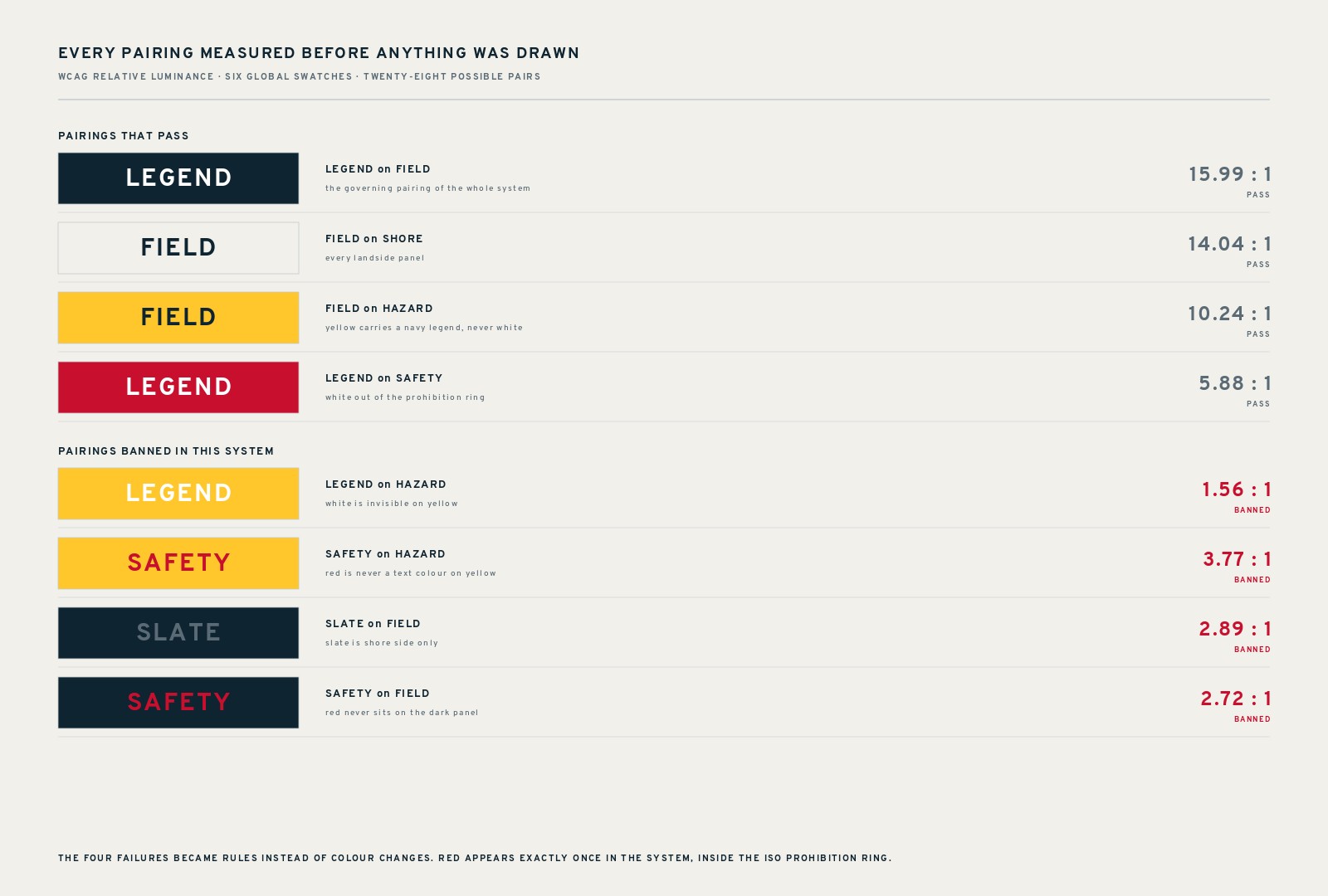
Every pairing measured before anything was drawn. Four pass, from legend on field at 15.99:1 down to legend on safety red at 5.88:1. Four are banned: legend on hazard yellow at 1.56:1, red on hazard yellow at 3.77:1, slate on a dark field at 2.89:1, and red on a dark field at 2.72:1. The four failures became written rules in the specification instead of quiet colour changes, which is what stops a fabricator reintroducing them on the next order.
The symbols
Twenty-four adopted, two drawn
Nothing is drawn that already exists in a standard. Twenty-four symbols are adopted, so a stranger has met them before, and exactly two are drawn new: the directional arrow and the cleat. Sourcing matters as much as the shape. The NPS set is public domain from nps.gov, so the sheet records where each one came from.
The documentation
No sheet repeats a template
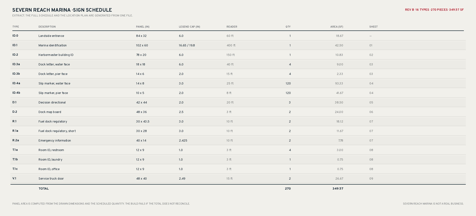
Ten sheets at ANSI B, each carrying elevations, dimension strings, a section detail, keyed notes, a title block and a revision block. A sign schedule of 270 pieces across 349.57 square feet, with the type scale as live formulas so a change to a reader distance recalculates the cap height.
The schedule a fabricator quotes from. Area is computed from the drawn dimensions, and the build fails if the total does not reconcile.
Each sheet carries its own technical decision: the frame weep, the fascia standoff, the angle the water face is set to, the shoulder bushing, the ADA clear opening, the 15 degree tilt that stops the map board mirroring the sky, the banned colour pairing drawn and struck out, the tactile character section, and the body crease nothing crosses. The tenth is the sign location plan, which places all 270 pieces on the site and reconciles its own count against the schedule at build time.
Every colour pairing in the palette was measured before anything was drawn. Four passed and four failed. White on hazard yellow measures 1.56:1 and is banned outright, which is also the code convention, so the measurement and the convention agree. The other three bans are red on hazard yellow at 3.77:1, slate on the dark field at 2.89:1, and red on the dark field at 2.72:1. Those failures became rules instead of colour changes, which is the stronger fix.
Accessibility here is procurement, not goodwill. The 2010 ADA Standards, sections 235.2 and 1003, require a 60 inch minimum continuous clear opening every 10 feet of linear pier edge, and a sign post set in that opening closes it. So the accessible route gets drawn before any sign location is fixed, and the post location plan shows it. On public and institutional work this is a line item. A sign package that closes a required clearance is a change order at best and a rejected submittal at worst.
What I would do differently
The constant that could not exist
Advance width is not a constant. Measured across every legend in this package it runs 0.67 to 0.99 of cap height: OFFICE FUEL SHOWERS ICE sits at 0.674 because the middots buy space, and a lone B on a dock letter sits at 0.986 because a single wide letter is its own advance. I found that the way you usually find these things, by assuming a constant twice and watching seven of eleven legends overflow.
That range is the whole finding. No single constant can size a panel correctly, which is why both of my constants failed. So the fix was not a third constant. Every legend is now measured against the actual typeface at its actual specified cap height, and the sizes live in one file the whole package builds from. If a legend does not fit its panel, nothing builds.
That check caught the panels. It did not catch the wordmark, because the wordmark was drawn by hand to fill the measure instead of being built from the spec. Reconciling the schedule against the drawn files, I found the type horizontally scaled to fit: SEVERN at 92.67 percent, REACH at 81.04. Squeezing a face thins its vertical strokes and leaves the horizontals alone, and it strips 19 percent of the reflective area off REACH, off exactly the strokes that carry the letter, which is the same argument this package already used to reject a display face on that sign. The system was contradicting its own documentation on its largest panel.
The sign was retyped at natural width. Each word now takes whatever cap fills the 90 inch measure without scaling. The lesson is narrower than the first one and more useful: an automated check only guards what it is pointed at. Mine measured legends and never looked at the logo.
I would also confirm the sightline on site. The marina identification sign is sized to an assumed 400 foot identification distance from the creek channel. That is a site condition I do not have, and it drives everything downstream: at 400 feet the panel is 8 ft 6 in wide, at 600 feet it is 11 feet 4. The sheet states it as an assumption and shows the sensitivity instead of pretending to a number I never measured. On a real job that is a site visit before anyone welds a frame.
Project
Severn Reach Marina, wayfinding and environmental graphics
Scope
Identity, sign types, documentation, location plan
Severn Reach Marina is not a real business and was not commissioned by a client. The site is a model. The constraints, the codes and the materials are real.