Self-directed: systems
Meridian Deck System
A presentation system for professional services, designed against the one constraint that breaks most templates: the people editing it are not designers.
Role: System design, typography, template engineering · PowerPoint · 2026
The problem
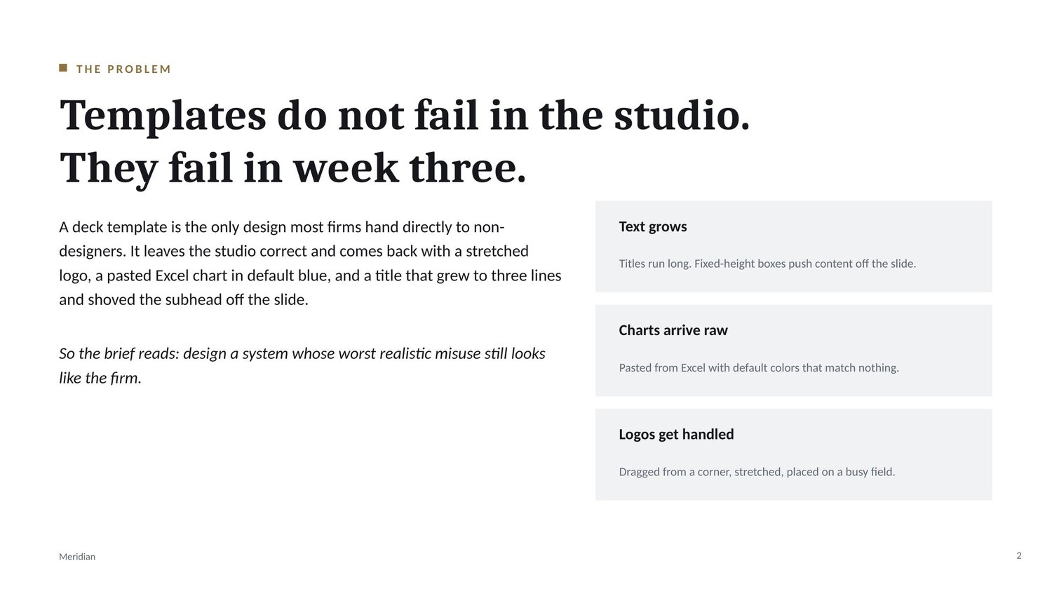
A deck template is the only design most firms hand directly to non-designers. It leaves the studio correct. Three weeks later it comes back with a stretched logo, an Excel chart pasted in default blue, and a title that grew to three lines and shoved the subhead off the slide.
So the brief reads: design a system whose worst realistic misuse still looks like the firm. That reframes the work. The deliverable is not fifteen attractive slides, it is a set of constraints that hold up when someone who has never opened a master slide starts typing.
The decision
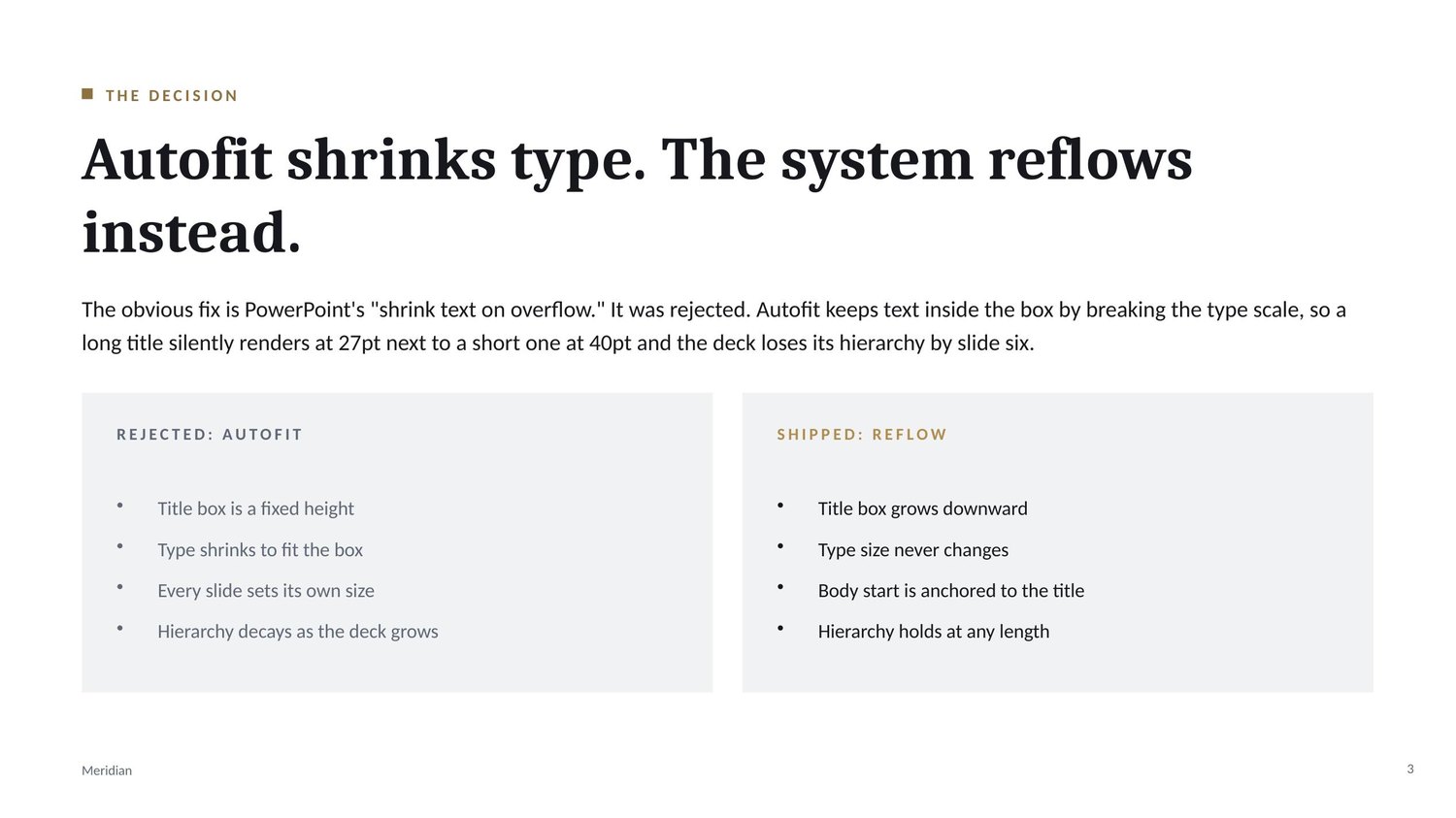
The obvious fix is PowerPoint's shrink text on overflow. I rejected it, and the deck says why on the slide.
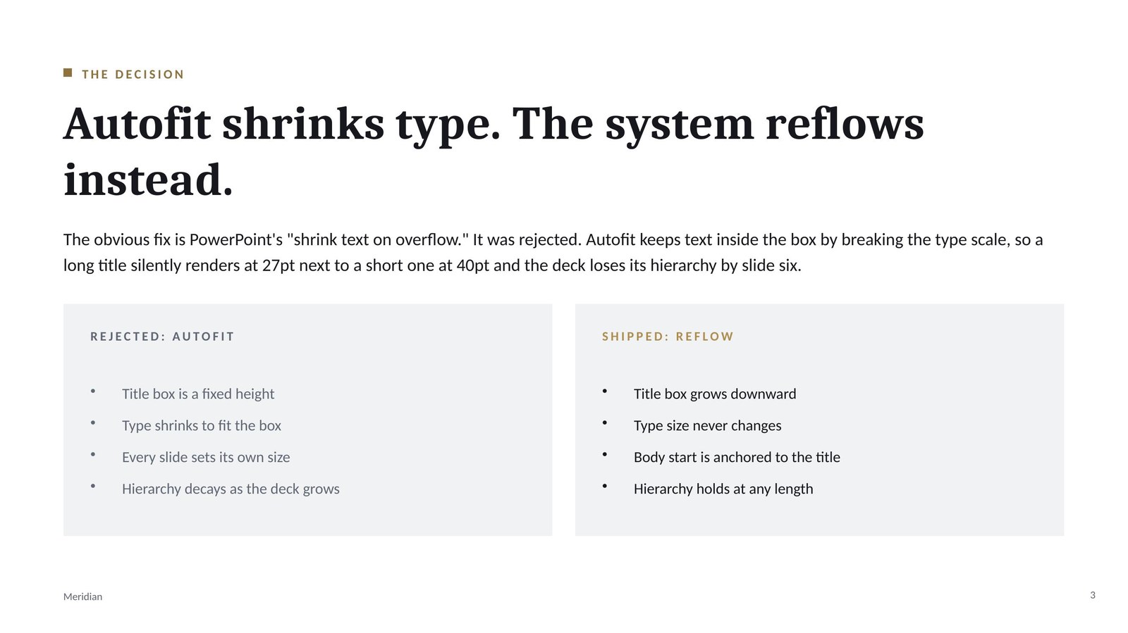
Autofit keeps text inside the box by breaking the type scale. A long title silently renders at 27pt beside a short one at 40pt, and by slide six the hierarchy that made the deck readable is gone. The system traded a visible problem for an invisible one.
What shipped instead is reflow. Title boxes are tall and top anchored, so a long title grows downward and the body moves with it. Type size never changes. If a slide still will not hold its content, the content splits across two slides.
Proving it rather than claiming it
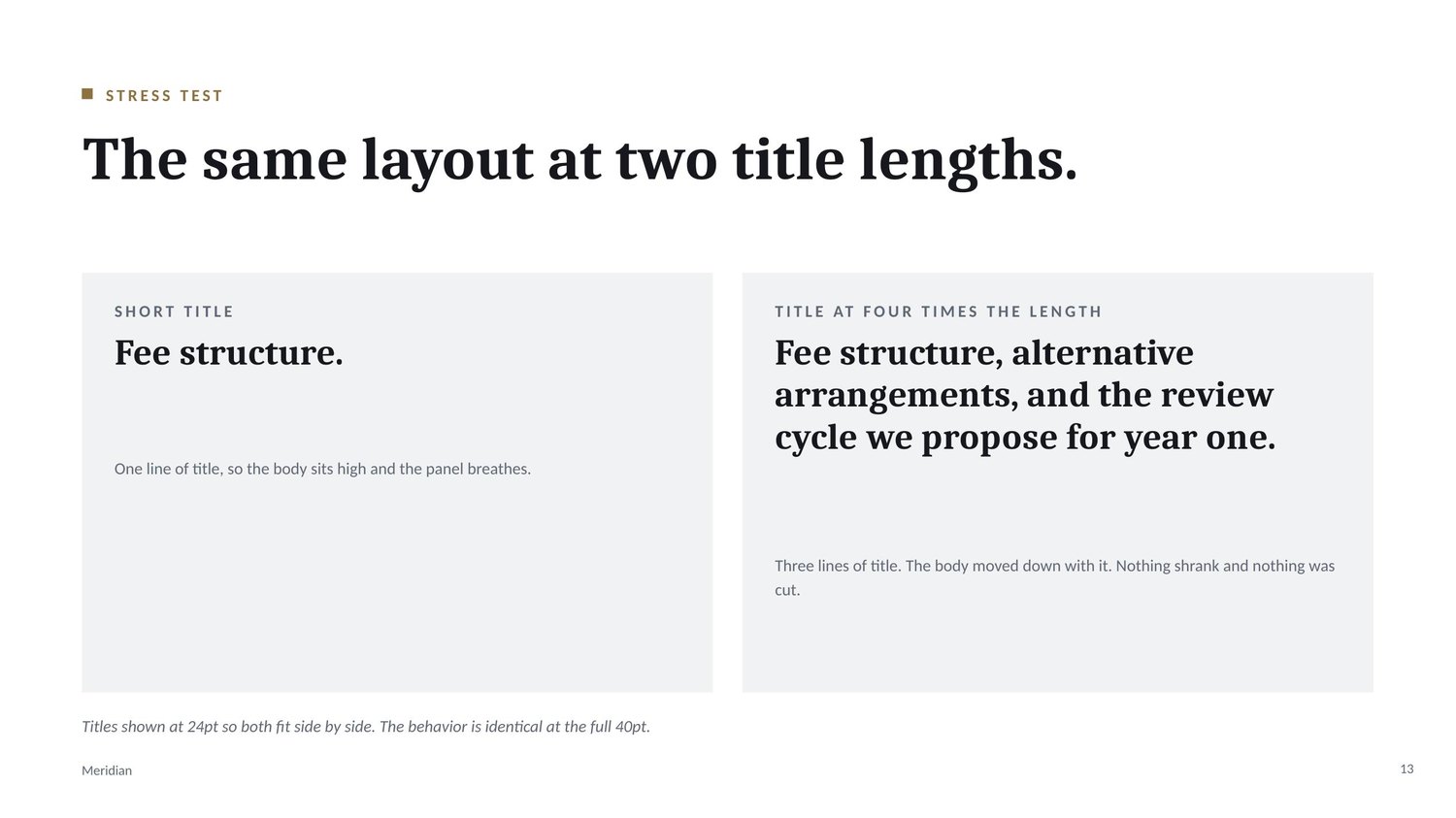
A system document can assert anything. This one gets stress tested inside itself: one layout, one type size, a short title beside a title four times longer.
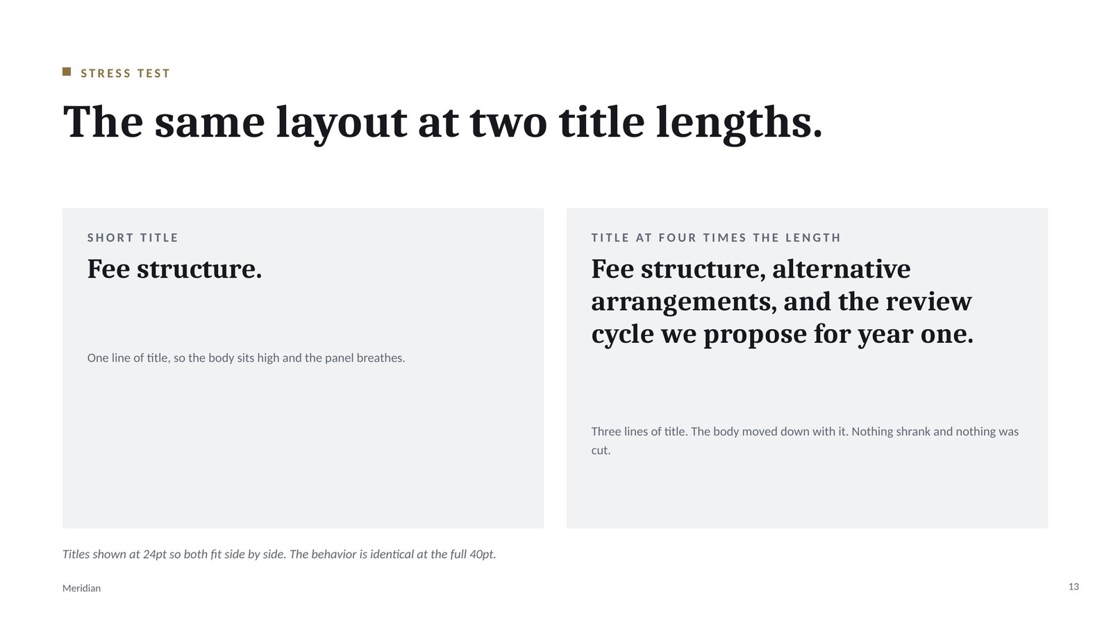
The body copy sits at a different height in each panel because the title pushed it there. Nothing shrank and nothing was cut. The caption on the slide states that the titles are shown at 24pt so both fit side by side, and that the behavior is identical at the full 40pt.
The palette failed its own check
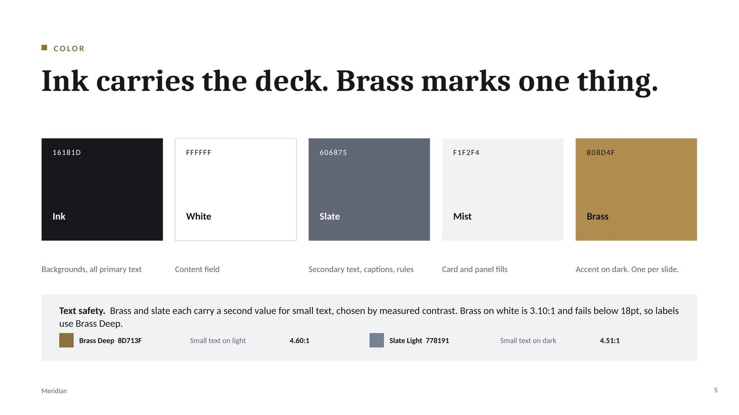
I measured every pairing against WCAG rather than trusting my eye, and two of my own choices failed. Brass on white came in at 3.10:1 and slate on ink at 3.16:1, both under the 4.5:1 that small text requires. My 11pt labels and captions were sitting in exactly those pairings.
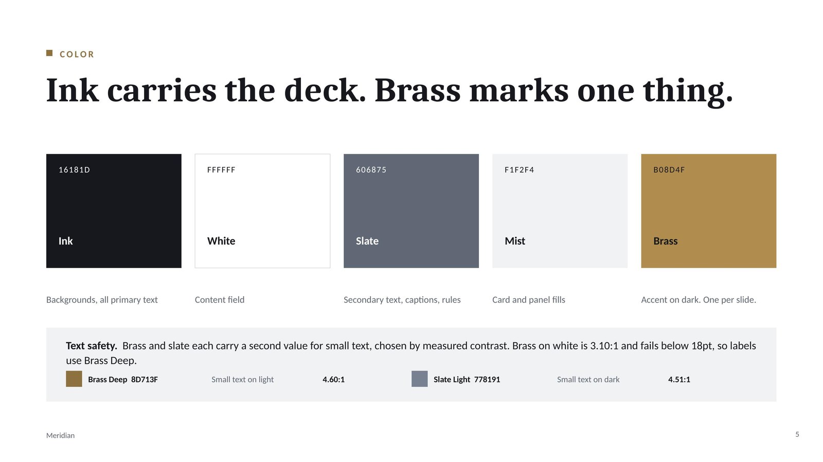
The fix made the system better than it was. Each accent now carries a second value chosen by measurement: Brass Deep at 4.60:1 for small text on light, Slate Light at 4.51:1 for small text on dark. Both values and both ratios are printed on the color slide and the rule sheet. For legal and corporate work this is commercial, not cosmetic, because accessibility shows up in procurement.
What actually ships
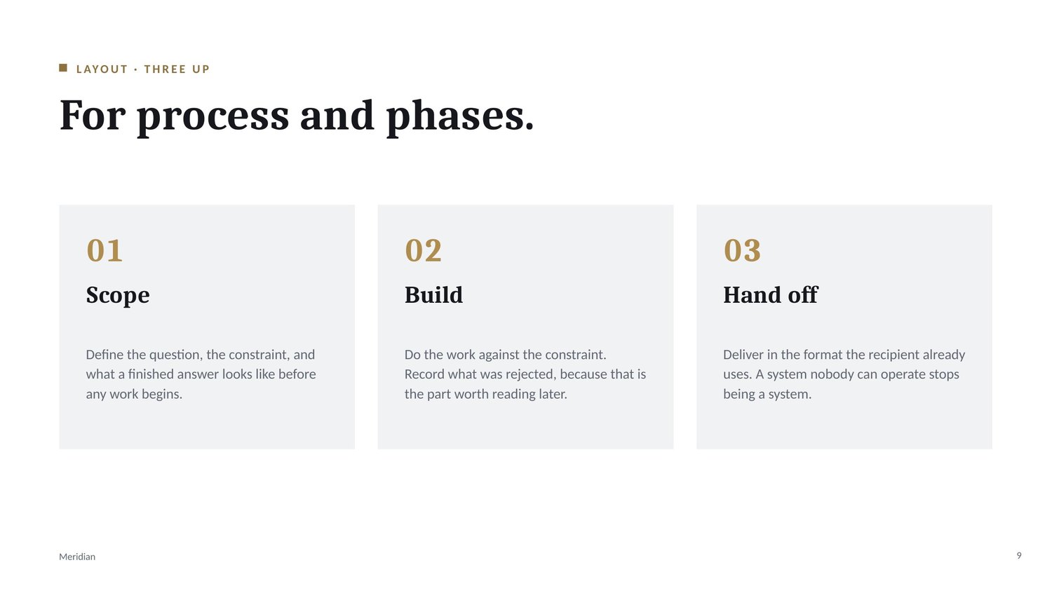
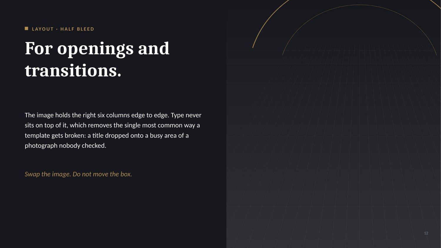
A .pptx with fifteen slides is a deck. A template ships the layouts, so the system delivers both: a demonstration deck, and a .potx carrying one slide master with four layouts, each with live title and body placeholders so New Slide gives you a working slide instead of a blank field.
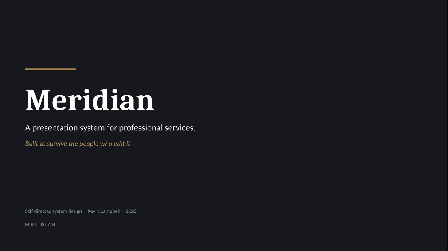
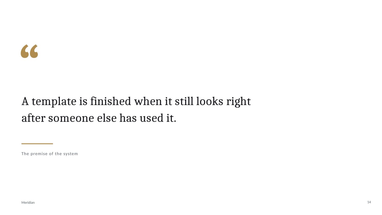
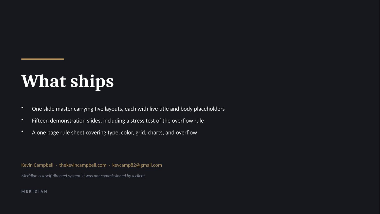
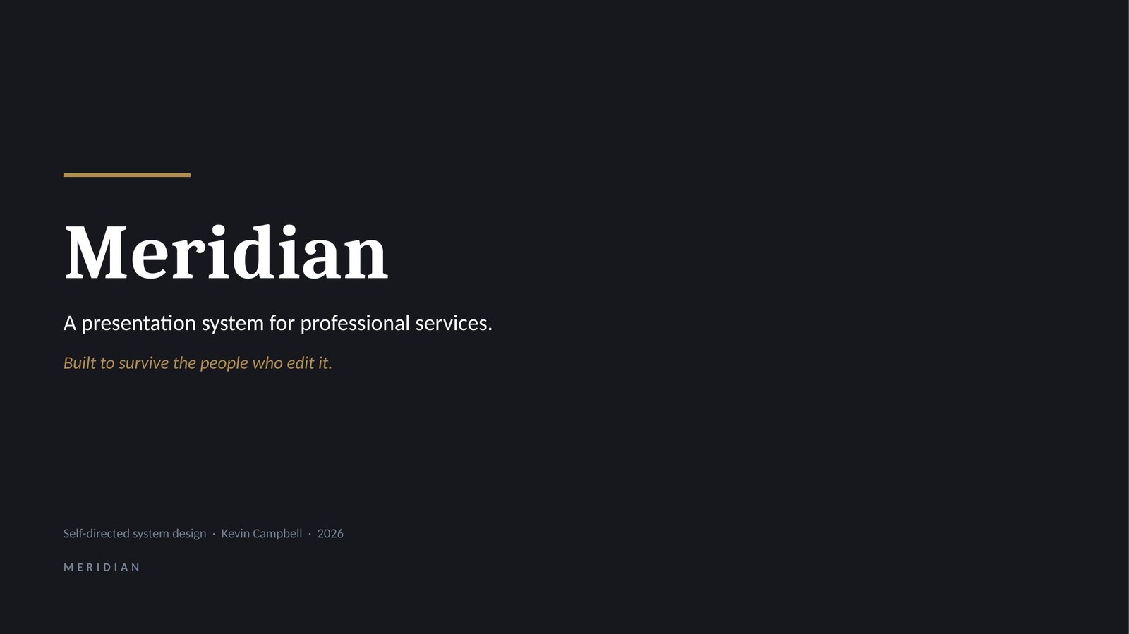
01 / 15 · Title slide
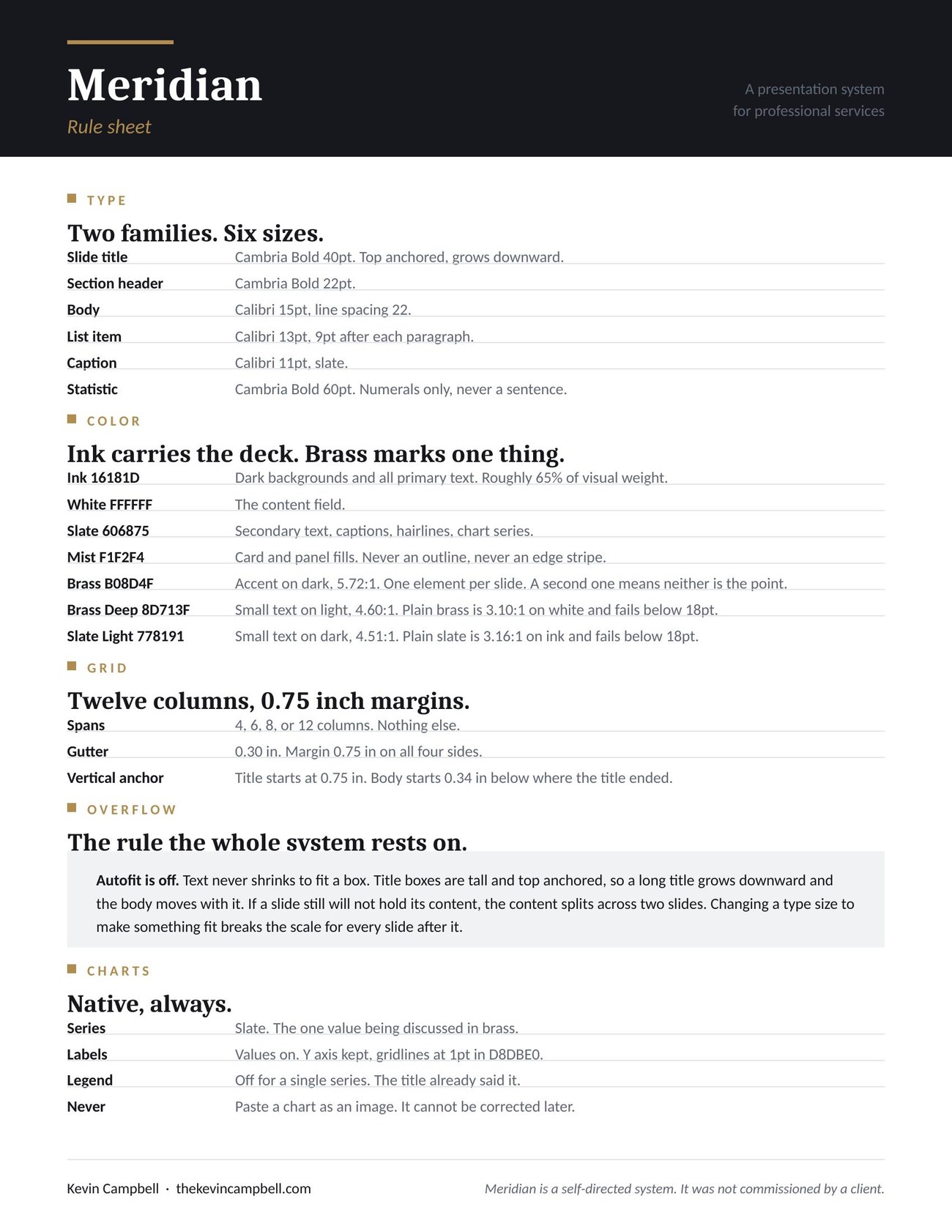
The rule sheet
One page covering type, color, grid, overflow, and charts. It exists so a non-designer can use the system correctly without asking, which is the whole point of the brief.
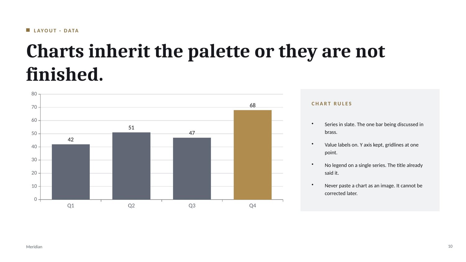
The chart rules are the shortest section and the one most likely to be ignored: series in slate, the one value being discussed in brass, no legend on a single series, and never paste a chart as an image, because an image cannot be corrected later.
What I would do differently
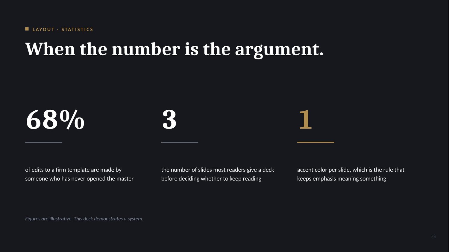
The demonstration deck carries figures that are illustrative rather than researched, and it says so on the slide. A version of this built for a real firm would use their numbers, and the statistics layout would earn its place instead of showing what it can do.
The palette is also narrow on purpose. One accent is easy to police and easy to teach. A firm with sub-brands or practice groups would need a second accent and a written rule for when each one applies, and that rule is the hard part, not the color.
NOTE
Meridian is self-directed. It was not commissioned by a client, and the deck states that on its title slide and its closing slide.
Previous project
← Act I: Launch ReelNext project
Ruben's Dupont Circle →