Client work
Ruben's Dupont Circle
Event identity and print campaign for a DC restaurant and late-night venue. Two events, two moods, one system. The client came back for the second.
Role: Design & Illustration · Poster, banner, print production · 2025
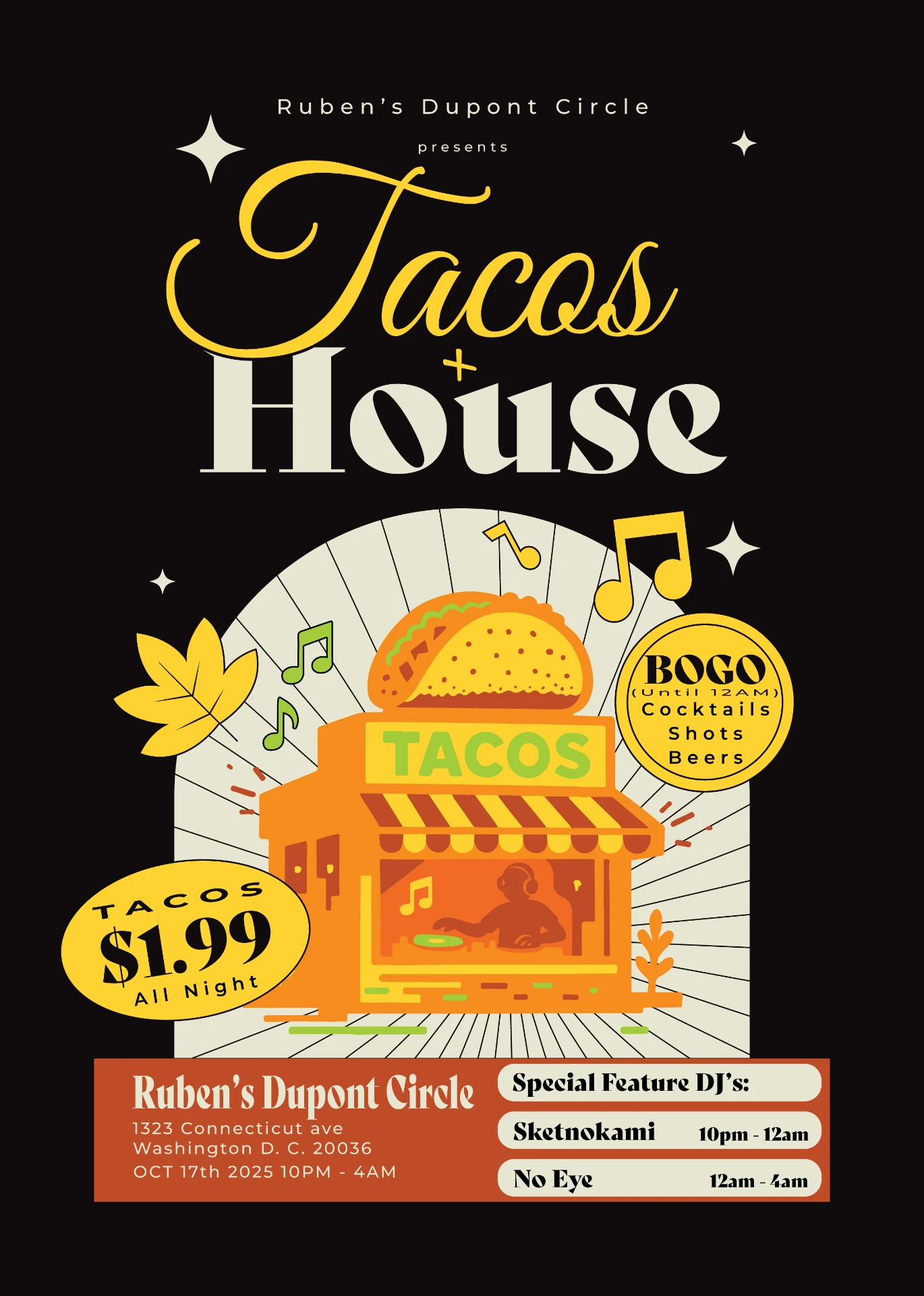
Tacos + House
Ruben's runs late-night events at 1323 Connecticut Ave. The brief for October: a poster for a house-music taco night that reads from across a bar. Script-over-serif title pairing, badge-shaped info stickers, and an illustrated taco stand with the DJ working inside it.
They came back: Friendsgiving
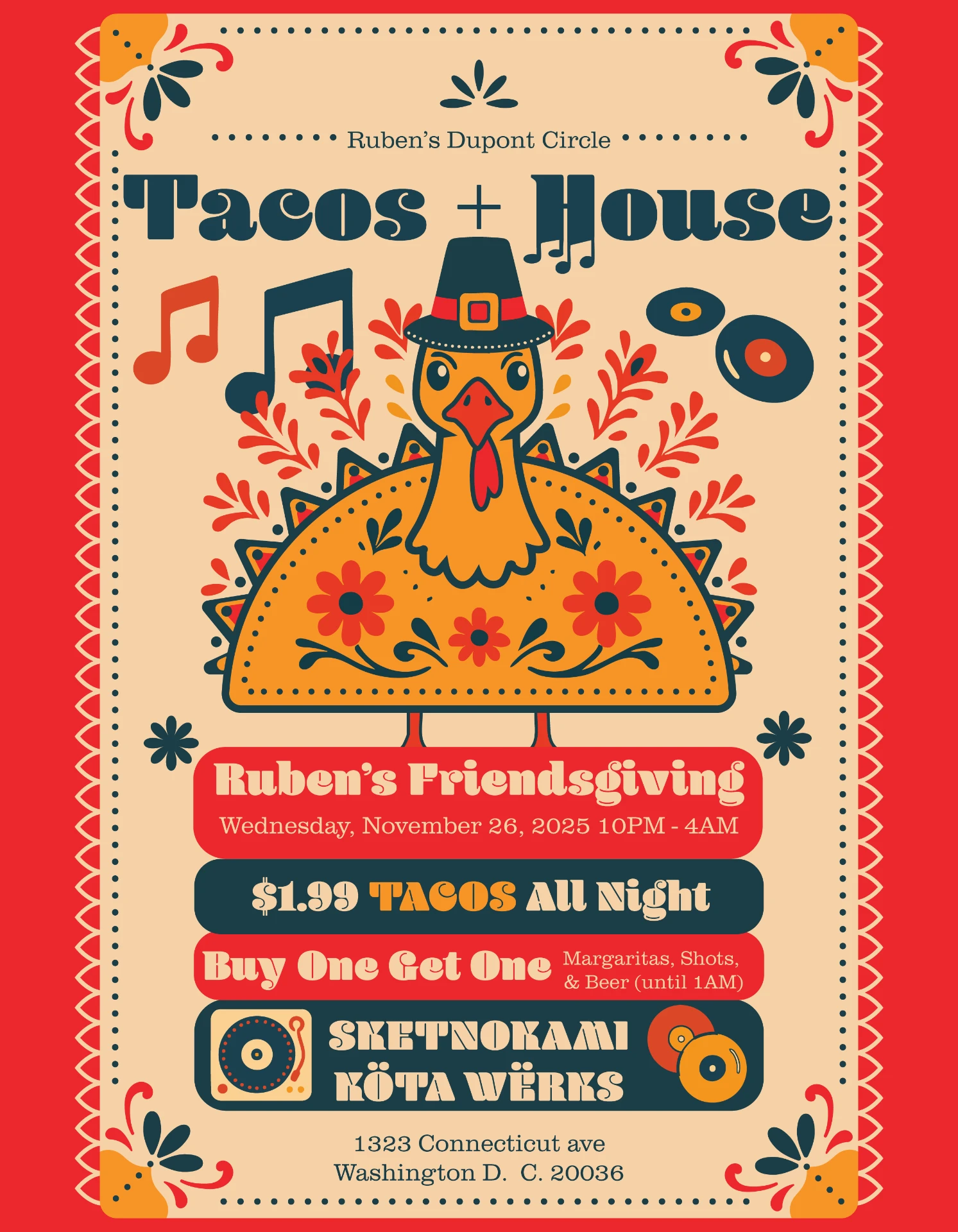
A month later Ruben's returned for their Friendsgiving event. Same brand, different mood. The late-night black-and-gold gave way to a folk-art system: papel picado border, a pilgrim-hat turkey rising from a taco shell, and a stacked information hierarchy holding date, specials, and the DJ bill in one readable column.
The hard part
The brief was Thanksgiving at a Mexican restaurant, and those are two visual traditions that do not naturally share a palette. Push toward autumn and the poster stops looking like Ruben's. Push toward the restaurant and it stops looking like Thanksgiving. The failure mode on either side is the same: two things sitting next to each other instead of one thing.
It took three passes on colorway and mood to get there. The first two were abandoned outright rather than adjusted, because the problem was never a color value. It was which of the two identities was being asked to give ground.
The final resolves it in one object. The papel picado border and the folk-art florals are unmistakably the restaurant. The pilgrim hat and the turkey are unmistakably the holiday. And the turkey sits inside a taco shell, which is what turns a collision into a single image rather than a compromise between two.
The October poster for the same venue ran black and gold, late-night, club-facing. Same client, same room, opposite register. That range is the job.
Two formats, two delivery problems
The poster ran at 8.5 × 11, output at Office Depot and put up around DC. That set its constraints before anything got drawn: consumer-grade printing with no color management, letter size so it could be run cheap and in volume, and a layout that had to survive being stapled to a pole competing with everything else on it. Flat color, heavy weights, every offer in a solid badge rather than fine type.
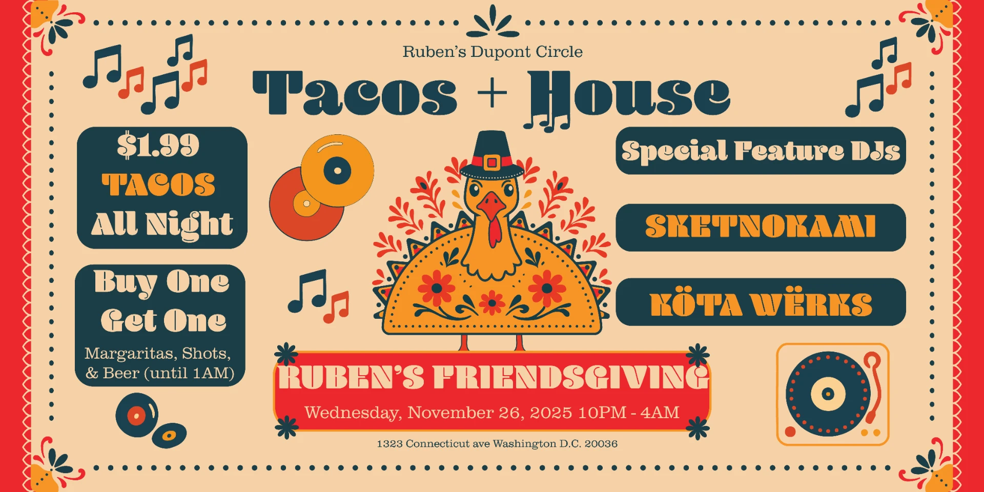
The banner had a different job. It was built for social and event listings like Facebook and Partiful, where the artwork becomes a header rather than a page. It gets cropped differently on desktop and mobile, carries the platform's own title, date and RSVP controls stacked over it, and is usually seen first as a thumbnail in a feed. Different medium, different failure modes.
So it is a rebuild rather than a crop. The turkey re-centers, the offers move into a left column, the DJ bill into a right one, the event bar drops beneath the illustration, and the papel picado border re-proportions to the new ratio. Palette, type and illustration hold; the architecture changes completely. Two outputs, two sets of rules, one system underneath. A design that only works at one aspect ratio is not a system yet.
What carried across
The two posters share a system (badge stickers for offers, an illustrated centerpiece, one stacked info block) while the palette and type voice shift with the event. Repeat work is the point: the first poster earned the second brief.
Previous project
← Meridian Deck SystemNext project
UMD College of Education →