Client work: editorial
UMD College of Education
A six-panel program brochure for two teacher-certification tracks, built to answer one question before any of the others: which of these am I?
Role: Layout, typography, print production · Adobe InDesign · 2020
The problem
The College of Education ran two teacher-certification tracks in special education. Track 1 certified for mild-to-moderate and severe disabilities. Track 2 was dual certification in general and special education. Both were four-year programs, both ended in a Year 4 internship, and both had nearly identical coursework.
A prospective student reading a list of requirements had no way to tell which one they belonged in. That is a sorting problem before it is a design problem, and everything else in the brochure only matters once it is solved.
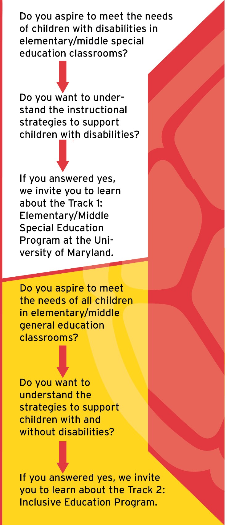
Two questions, then a direction
The first panel carries no program information at all. It asks two questions and points.
Answer yes to the first and the arrow sends you to Track 1. Answer yes to the second and it sends you to Track 2. Two decisions and a reader arrives at the rest of the brochure already knowing which half is theirs.
Having nothing else on that panel is what makes it work. Every other surface competes for the same attention. This one only sorts.
Two tracks, one structure
The inside runs both tracks as mirrored columns, gold on the left and red on the right, asking the same questions in the same order down each: what you are certified to teach, what the coursework focuses on, what happens in Year 3, what happens in Year 4, and who mentors you.
Holding that order identical is what makes the spread readable two ways. A routed reader goes down one column. An undecided reader reads across.
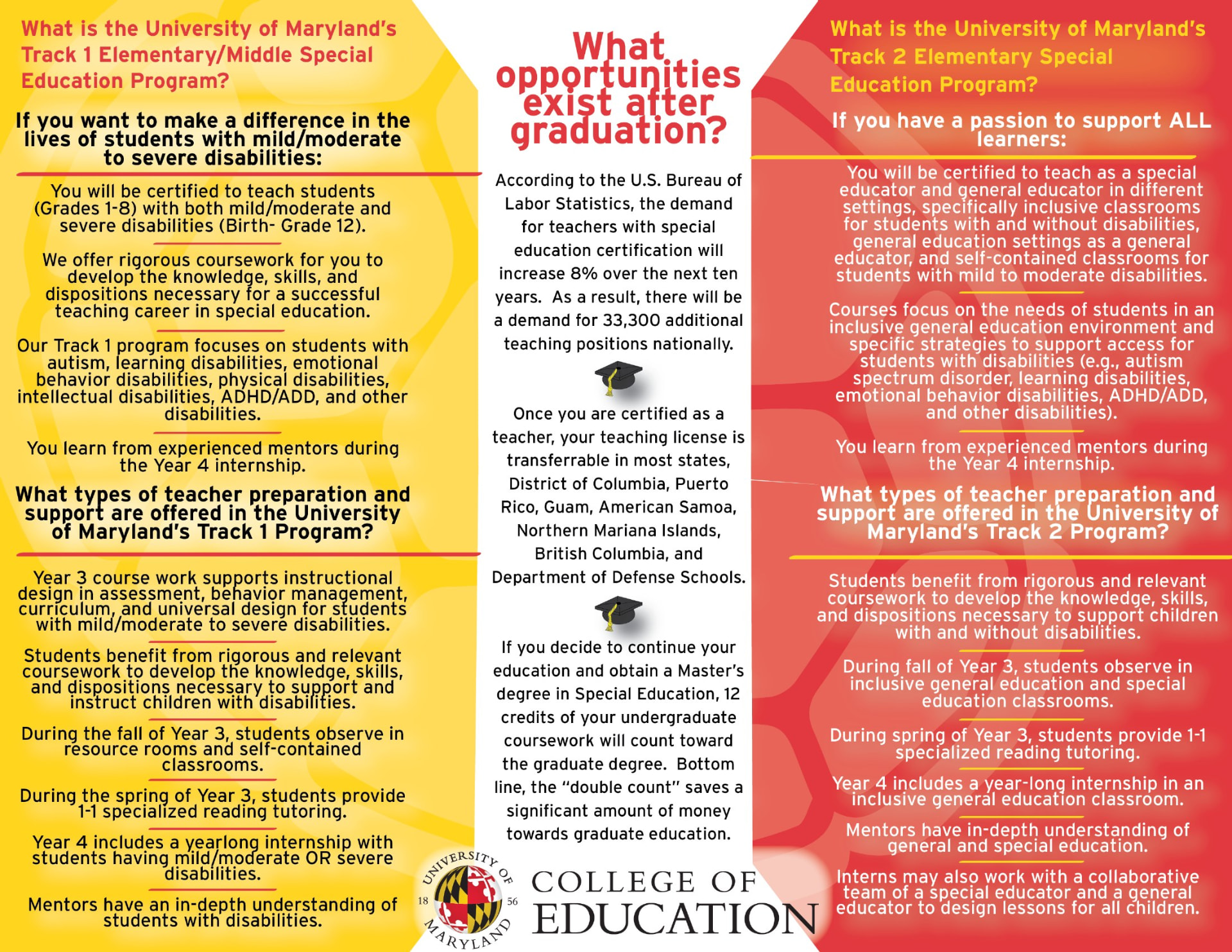
The center panel stays deliberately neutral and carries only what is true of both: employment outlook, where the license transfers, and how undergraduate credits count toward a master's. Anything track-specific in that column would have undone the sorting the first panel just did.
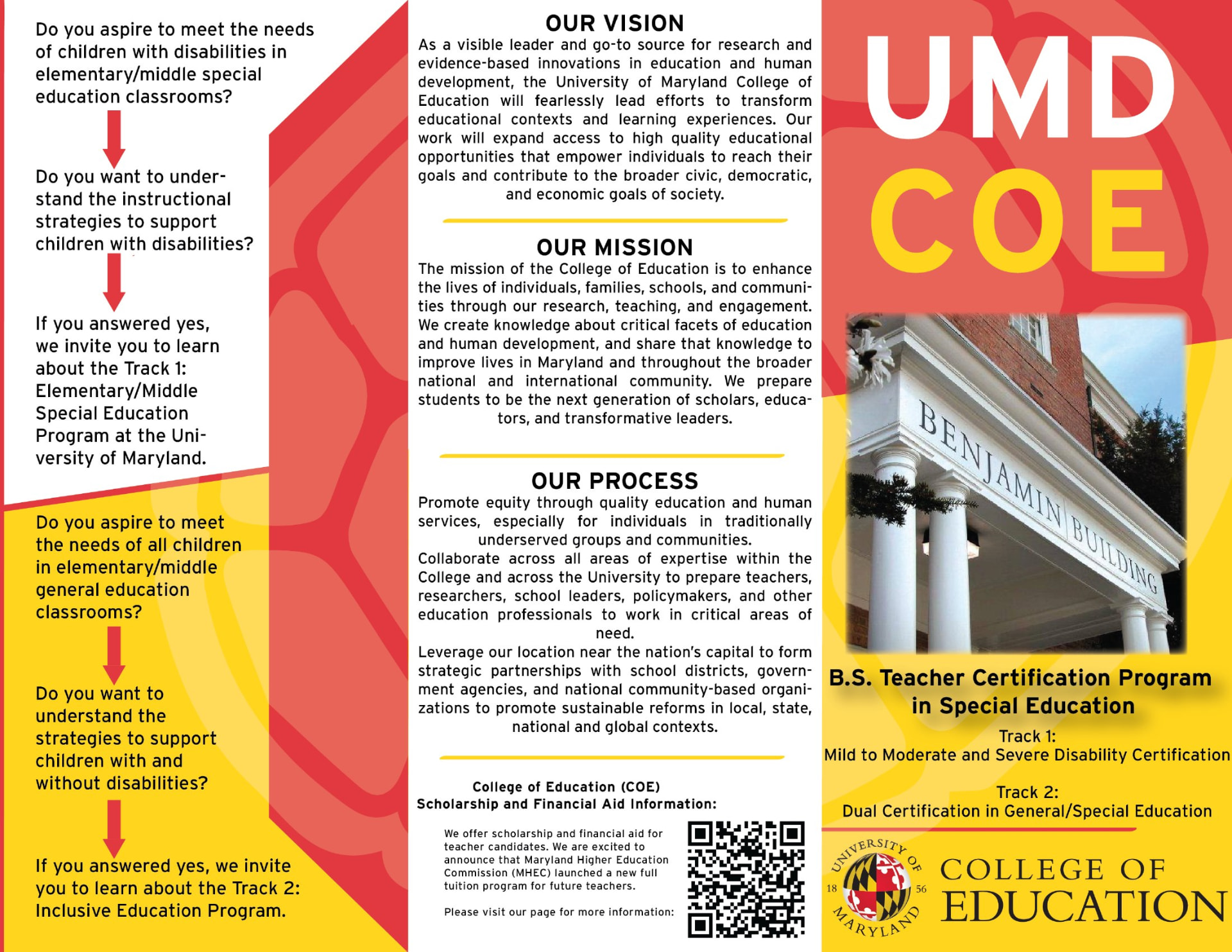
Working inside a brand I did not own
Maryland red and gold, the university seal, the Benjamin Building on the cover. None of it was mine to change, and none of it should have been.
The work was making dense institutional copy navigable inside a fixed palette and a fixed mark. That is most of what publication design actually is, and a set of constraints someone else wrote gives you something to push against.
What I would do differently
This is 2020 work and the typography shows it. The body copy is justified in narrow columns, which has produced rivers and awkward hyphen breaks. Most of the inside is centered, which is harder to read at length than it looks on screen. The hierarchy leans on size and weight where it should be leaning on space.
The structural thinking holds up. The routing panel would survive a redraw today and I would still open with it. The typesetting is what the following years fixed, and I would rather show the file as it shipped than a version I quietly repaired.
Previous project
← Ruben's Dupont CircleNext project
Köta Wërks →